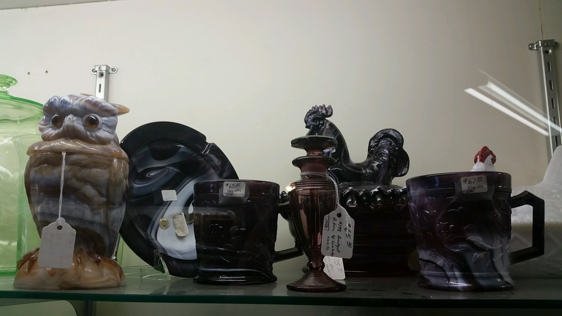
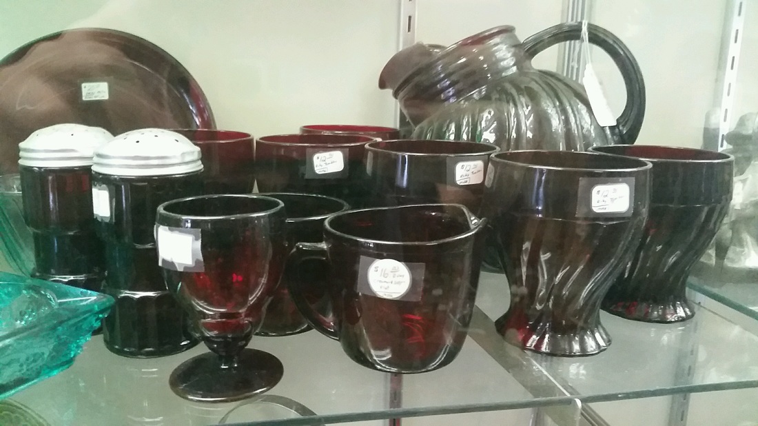
      For these photos I went to the Blissfield antique mall and arranged various objects I found into monochromatic color groups. I chose to do a monochromatic color scheme because it was moderately easy to find objects of the same color near each other and I wanted to work quickly in order to avoid the prying eyes of the store owner. He's a conservative and makes me uneasy so I wanted to avoid any conflict with him.
0 Comments
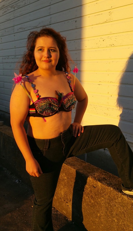
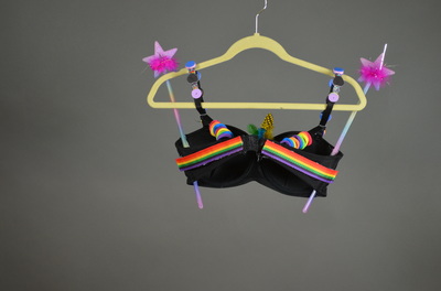
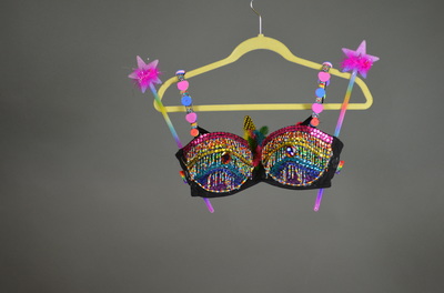
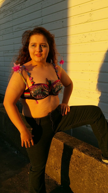
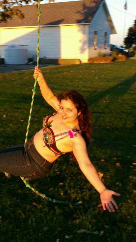
The themes that inspired this bra are “power” and “change”, and I decided to represent these themes through the LGBTQA+ movement. There is a lot of strength required to power thorough the hardships on the road to chance regarding equal rights to members of the LGBTQA+ community. I chose to mostly cover my bra in rainbow colors to show that there have been great strides of progress in society today regarding the acceptance of the gay community, but there is still much room for improvement. On the straps are foam beads color coded to resemble the other pride flags that are often underrepresented. I made them outside the focal point of the bra to bring the fact that there are more gender identities and sexual orientations that deserve to be recognized.
|
Emily CuetoHeyyo, I like Paramore. Archives
March 2017
Categories
All
|
 RSS Feed
