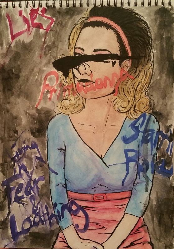
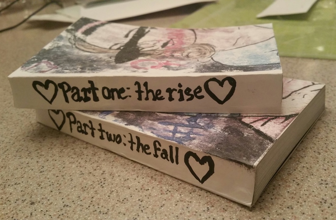
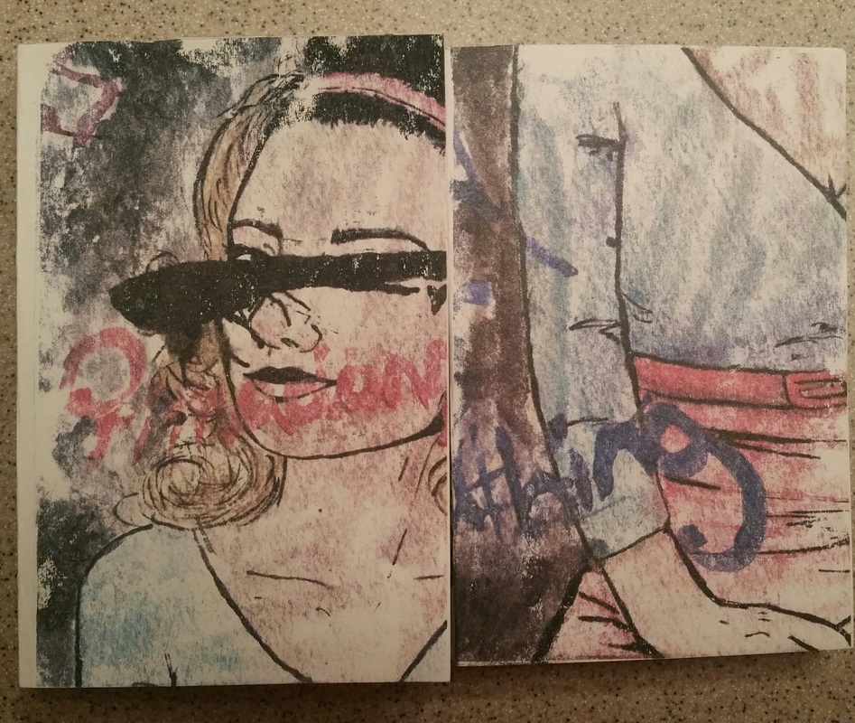
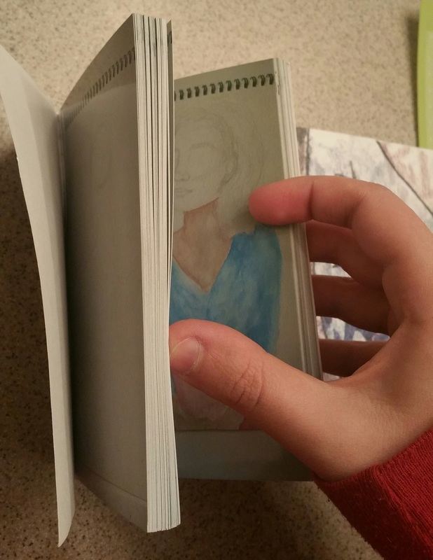
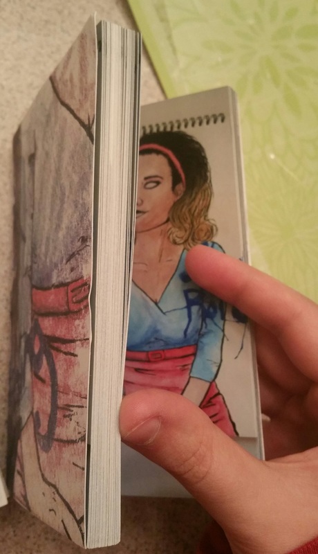
For my final project I designed and produced a flip book based on one of my favorite albums of all time, Electra Heart by Marina and the Diamonds. I decided to make the book a time-lapsed animation of the process of me painting the life and death of the character Electra Heart. The lyrics and song titles I included were some of the ones I felt had effected me and the development of her character the most. Electra Heart was meant to be a passing phase from the beginning and I feel like many aspects of myself are temporary as well. This book is meant to symbolize me moving past the previous versions of myself and growing into something new and more stable.
0 Comments
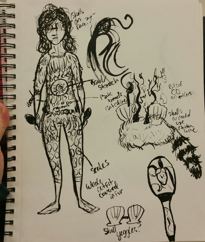
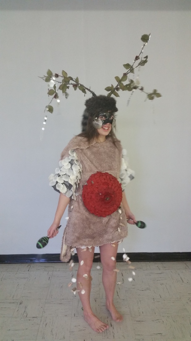
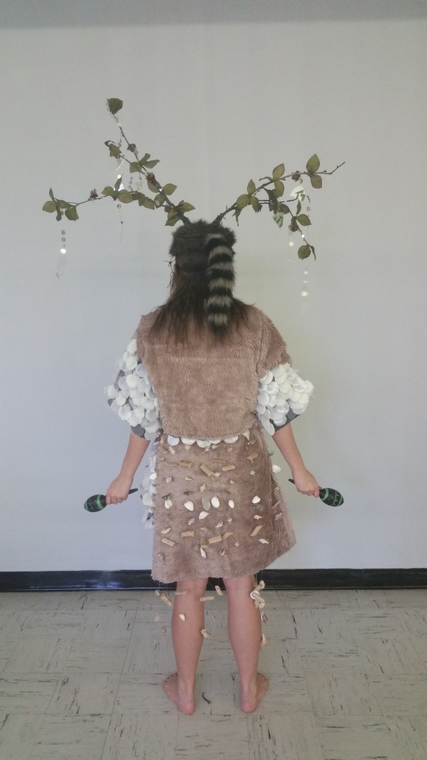
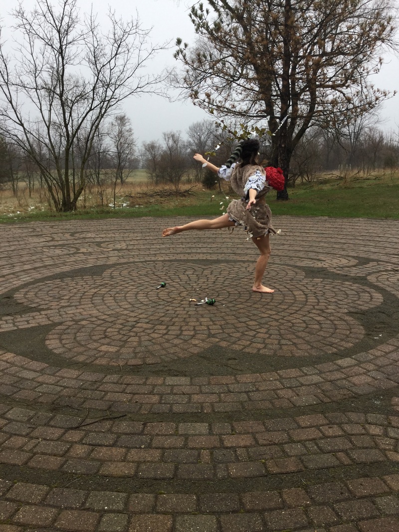
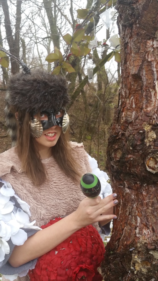
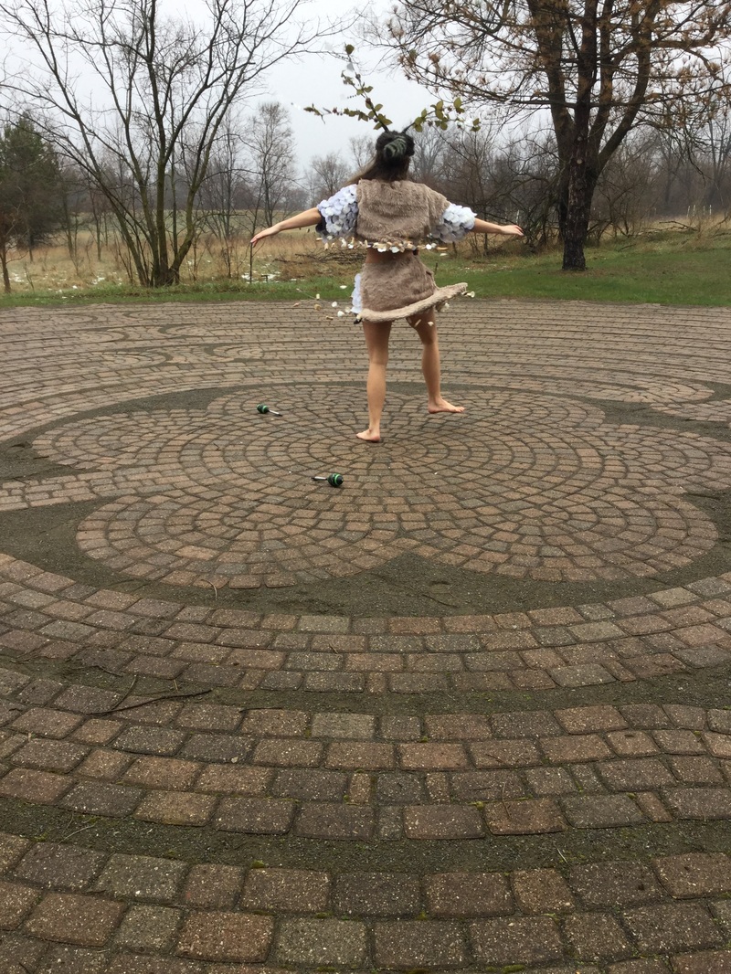
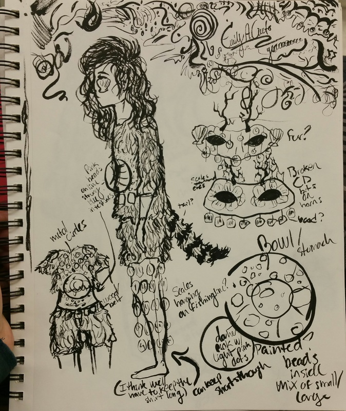
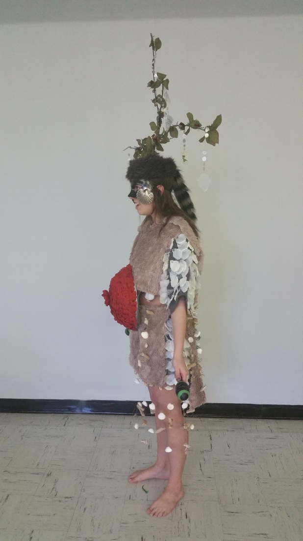
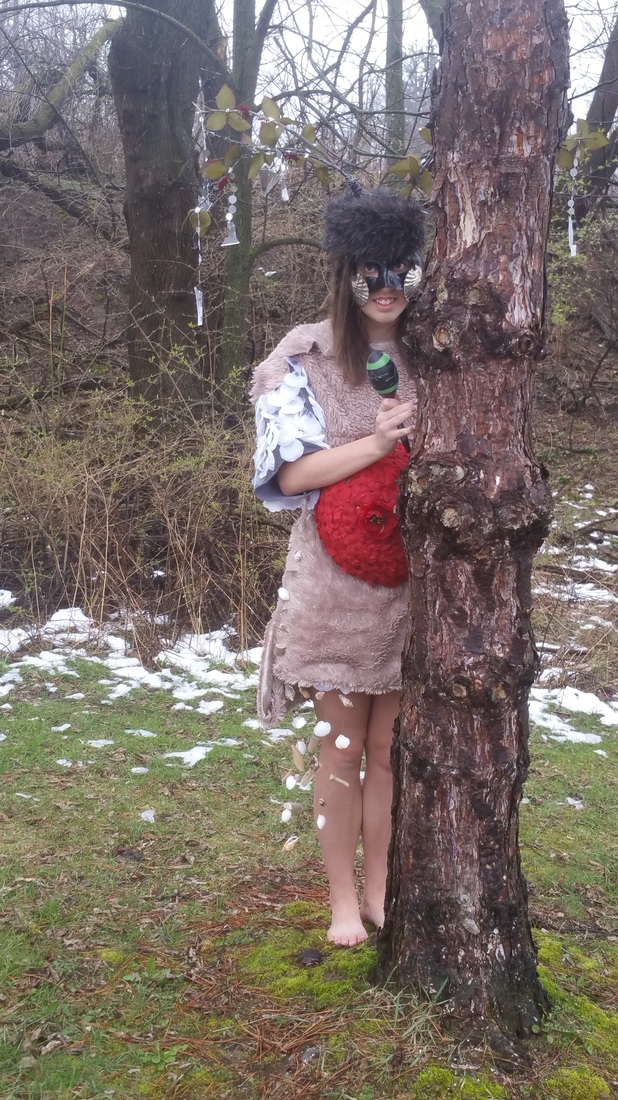
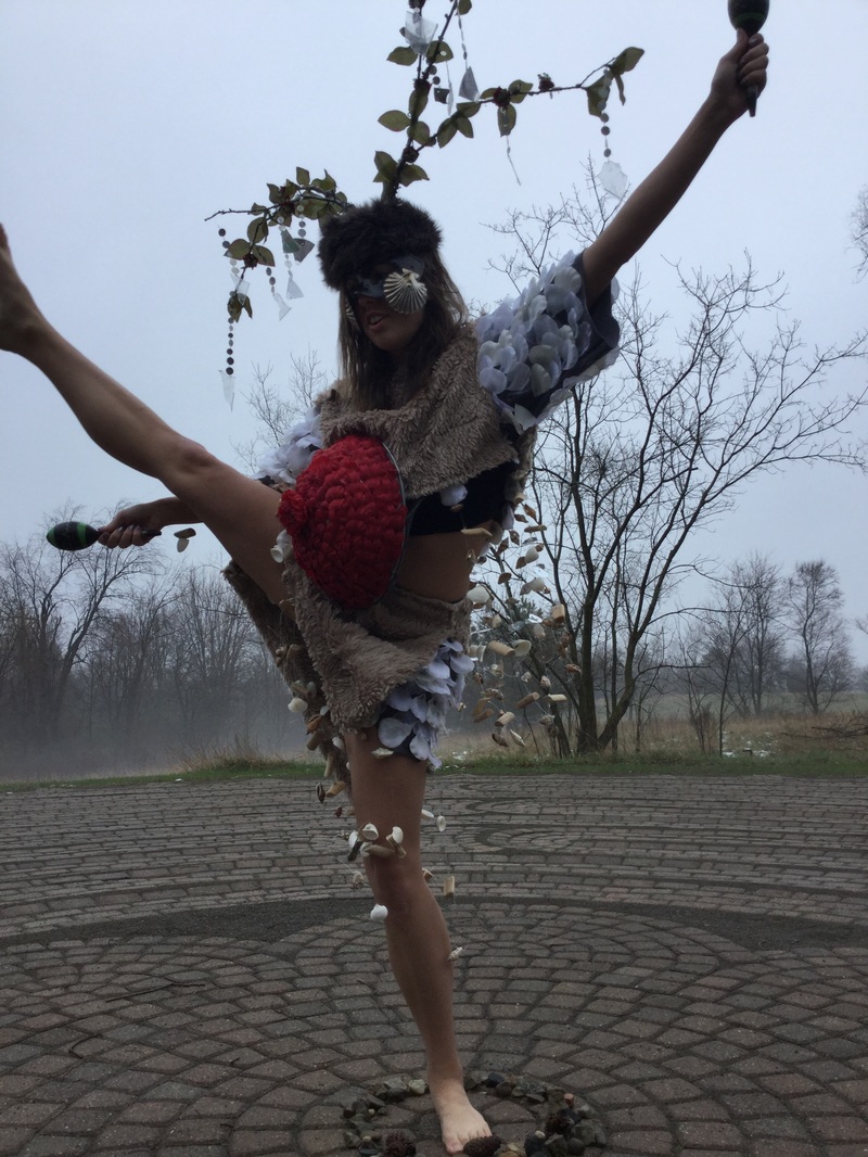
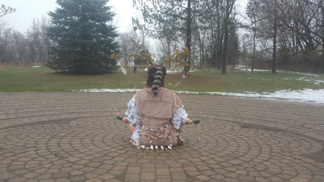
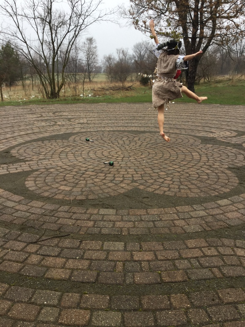
For this project we were assigned into groups of three and tasked with creating and then performing a body suit in the style of Nick Cave and Jana Sterbak. We also had to include one word from each element of the Wu Xing chart. The words we chose from each element were: Wood: Scaly, Fire: Pulse, Earth: Stomach, Metal: Furred, and Water: Shelled. We went with the aspects of each element that would come together best in order to create a sort of "forest spirit" character. The performance was really meant to show the balance and connection between body and nature. Alissa starts and ends the performance sitting on the ground and directly interacting with the natural energy or "pulse" of the world. Her actual dance is meant to be like the energy flowing through her and sort of guiding her movements. The dance is also cyclical, like Wu Xing, starting and ending with the same actions. We chose to film at the labyrinth because of the mystical vibes you get from being there. It's also far enough from campus that you can't see many buildings and it really feels like you're lost in nature for the time being.
Solvent Transfer Montages on the Taoist Theme of Wu Xing and in the Style of Robert Rauschenberg4/6/2016
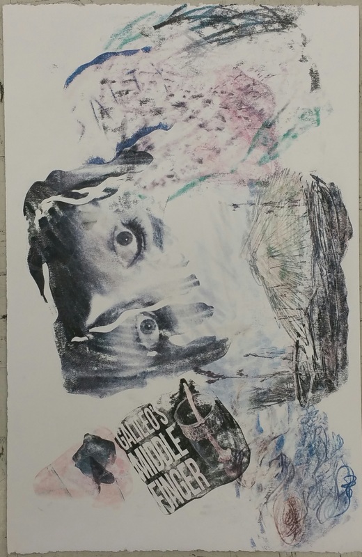
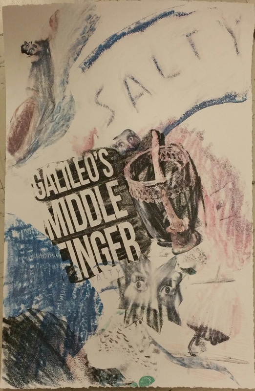
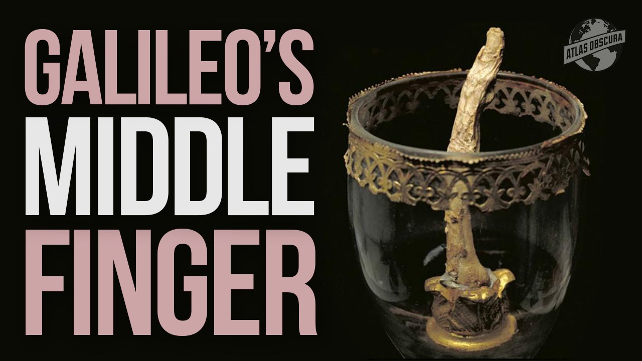
For this project we made our own Cirtisolv transfer prints in the style of Robert Rauschenberg and using influences from the theme of Wu Xing. The images used in the transfer are each related to a specific part of the five elements of Wu Xing; wood, fire, earth, metal, and water. The words associated to the elements I used in my prints are; Jupiter, scaly, sweat, scorched, saliva, middle finger, large intestine, nose, fear, and salty. This project was somewhat difficult for me since collage really isn't my strong point. It's definitely something I hope to improve on in the future since I love the results so much. Sources for all images used:
Mushroom: https://pixabay.com/static/uploads/photo/2015/11/16/09/47/mushroom-1045490_960_720.jpg Jupiter: https://pixabay.com/static/uploads/photo/2012/01/09/10/42/jupiter-11618_960_720.jpg Scorched: https://upload.wikimedia.org/wikipedia/commons/0/0f/DirkvdM_santa_fe_scorched.jpg Sweat: https://c1.staticflickr.com/7/6146/6032270876_7c2d297e6b_b.jpg Middle Finger: https://i.ytimg.com/vi/hC2yvfiOC7c/maxresdefault.jpg Crystal Spit: https://upload.wikimedia.org/wikipedia/commons/1/12/Allismicro_crystalized_saliva_8.jpeg Large Intestine: https://i.ytimg.com/vi/a2Z_oj-kPME/maxresdefault.jpg Nose: https://upload.wikimedia.org/wikipedia/en/thumb/e/ef/St_Pancras_Nose.jpg/359px-St_Pancras_Nose.jpg Salt: https://i.ytimg.com/vi/imTr8Vhe9HU/maxresdefault.jpg Fear: https://upload.wikimedia.org/wikipedia/commons/c/c2/COS_09.JPG
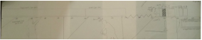
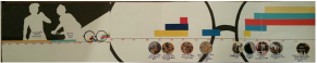
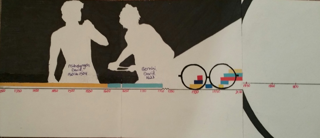
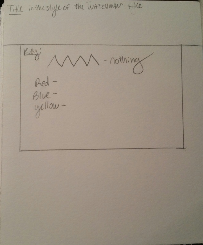
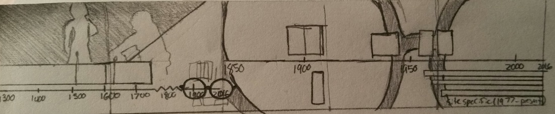
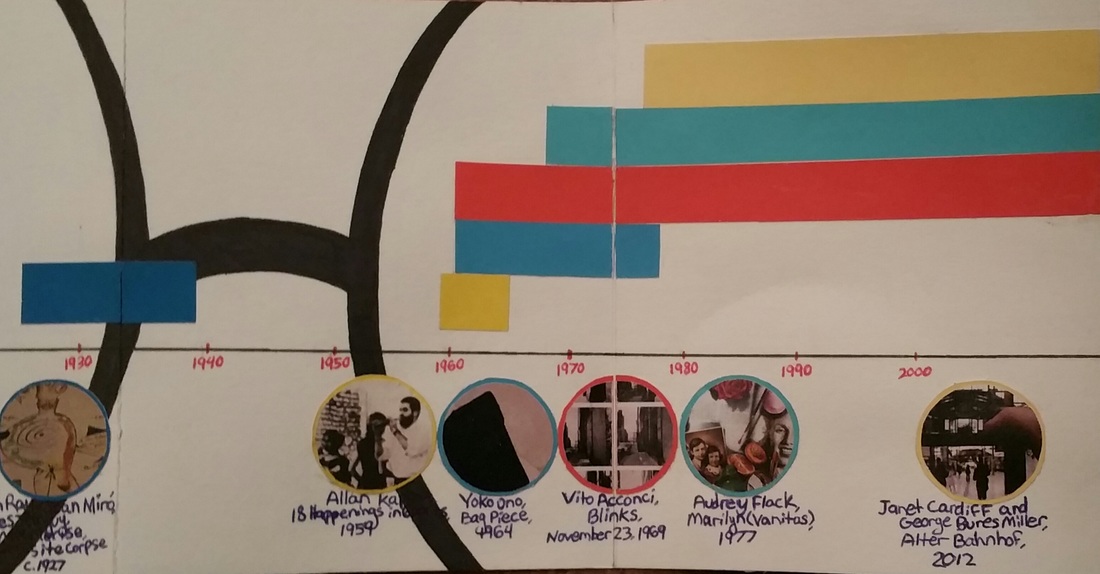
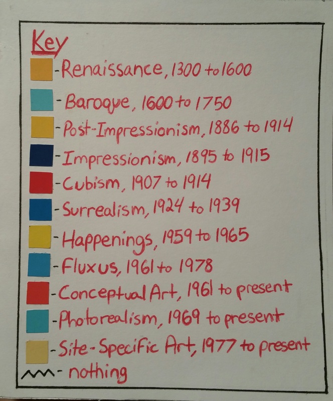
Here is the original sketch and finished product of the timeline key. For this project we each selected a graphic design artist from a list provided whose style we would be modeling our timelines after. For this project I chose Chip Kidd, the designer of the Jurassic Park logo. We cut a piece of stonehenge into three pieces for our first draft, final product, and an extra sheet to use in case of any mistakes made. It was very difficult for me to visualize what the design would look like laid out, and I think that's pretty clear to see in my first sketch. Meeting with Mad and Peter really helped me figure out what I was going to do with my timeline, and actually the glasses (which are my favorite part) was Mad's idea. I decided to use the silhouettes and primary RYB primary colors since they're two pretty prominent aspects of Chip Kidd's designs. All of the colors on the timeline and the small pair of glasses are cutout of coloraid paper that was provided to us. All of the rest of the black is Sharpie and the writing is just in pen. I decided put a key on the front of the book showing the colors linked with each art movement rather to label each rectangle on the timeline in order to keep it from being too crowded.
|
Emily CuetoHeyyo, I like Paramore. Archives
March 2017
Categories
All
|
||||||||||||
 RSS Feed
