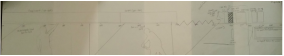
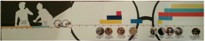
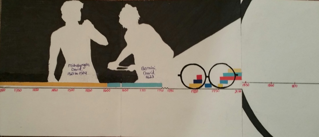
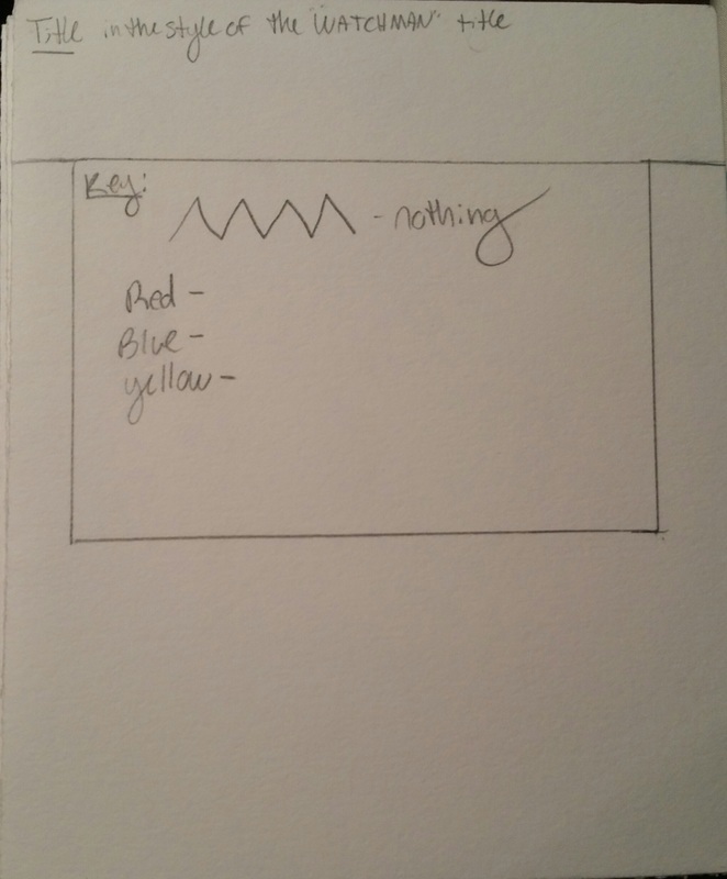
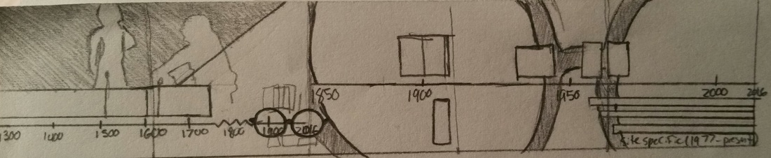
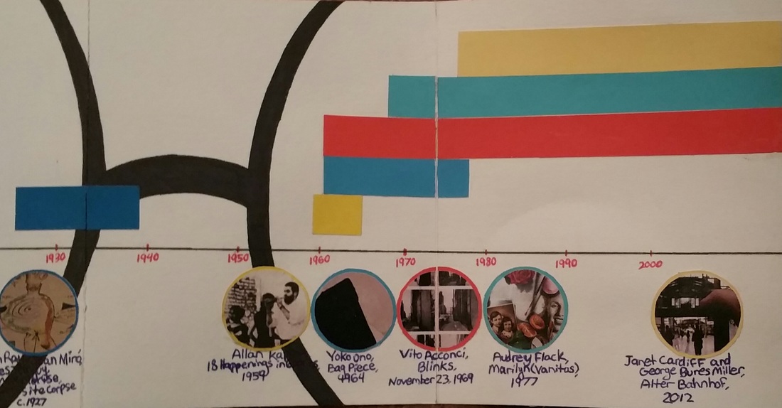
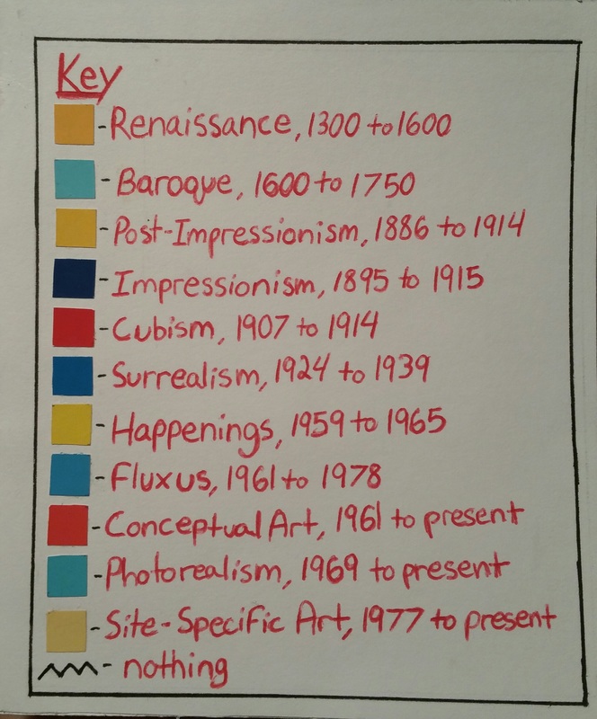
Here is the original sketch and finished product of the timeline key. For this project we each selected a graphic design artist from a list provided whose style we would be modeling our timelines after. For this project I chose Chip Kidd, the designer of the Jurassic Park logo. We cut a piece of stonehenge into three pieces for our first draft, final product, and an extra sheet to use in case of any mistakes made. It was very difficult for me to visualize what the design would look like laid out, and I think that's pretty clear to see in my first sketch. Meeting with Mad and Peter really helped me figure out what I was going to do with my timeline, and actually the glasses (which are my favorite part) was Mad's idea. I decided to use the silhouettes and primary RYB primary colors since they're two pretty prominent aspects of Chip Kidd's designs. All of the colors on the timeline and the small pair of glasses are cutout of coloraid paper that was provided to us. All of the rest of the black is Sharpie and the writing is just in pen. I decided put a key on the front of the book showing the colors linked with each art movement rather to label each rectangle on the timeline in order to keep it from being too crowded.
0 Comments
Leave a Reply. |
Emily CuetoHeyyo, I like Paramore. Archives
March 2017
Categories
All
|
 RSS Feed
