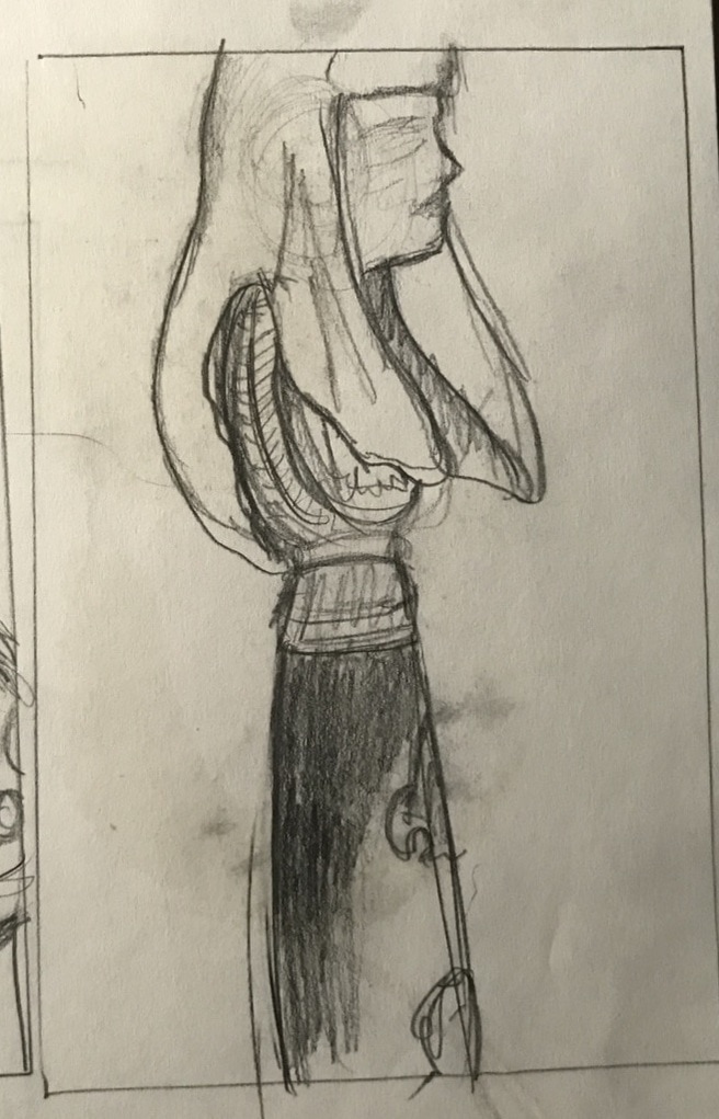
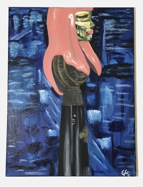
  For our final painting we all joined forces once more in order to create another collaborative still life. I chose to focus on a pretty minuscule area of the still life comparatively because of how regal Nicki Minaj's head looked perched on the handle of a sword. We were also required to make a narrative for our paintings and I chose to go with a sort of authoritarian monument looming over a cityscape. I also decided to mess around with the contrast between the figure and background, making the figure highly realistic and the background blurry and abstract.
0 Comments
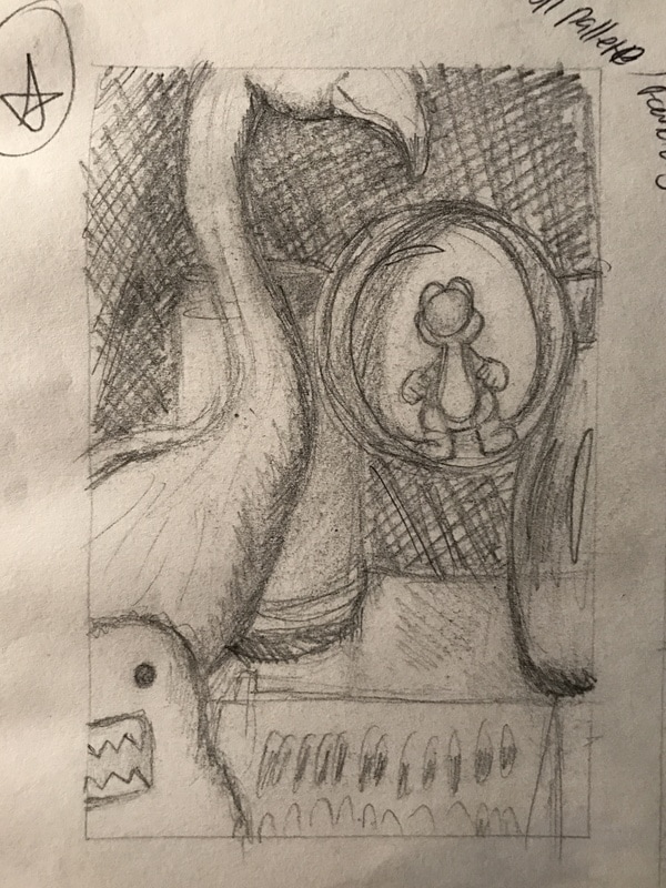 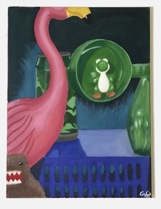 For this painting we were told to run to our dorms (or in my case my car) and grab as many interesting objects as we could and create our own still life together as a class. We all ended up gathering quite a few blue and green items so there wasn't quite the broad range of color that we were striving for initially but it was interesting none the less. I feel that I was pretty successful with rendering textures in this painting overall and the blending on the flamingo was probably the best I did all semester.
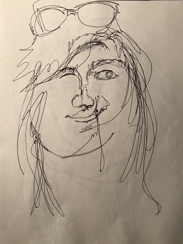
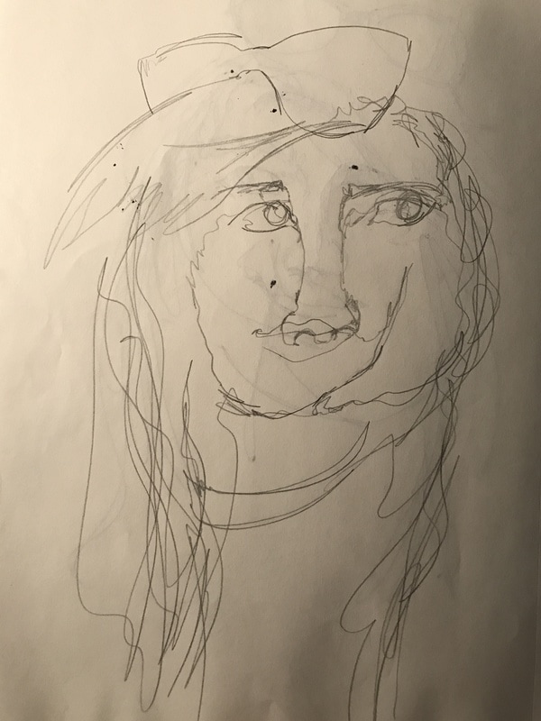
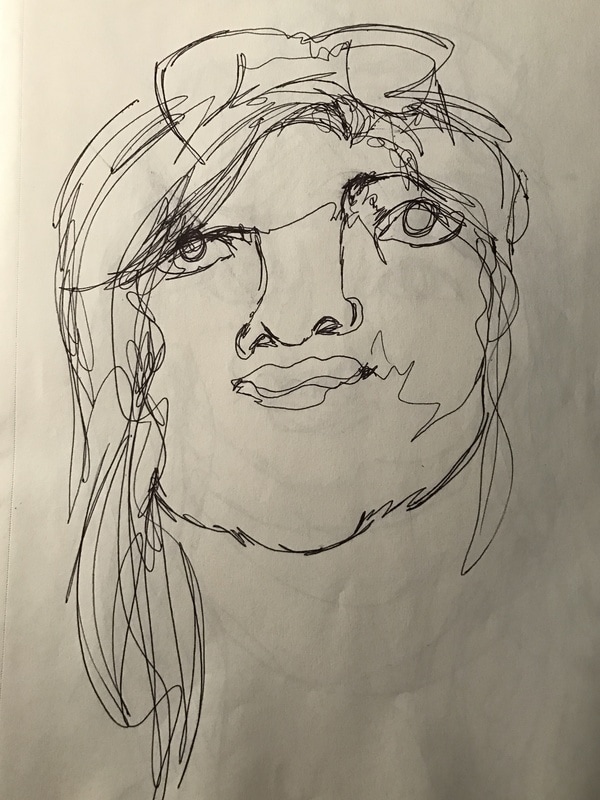
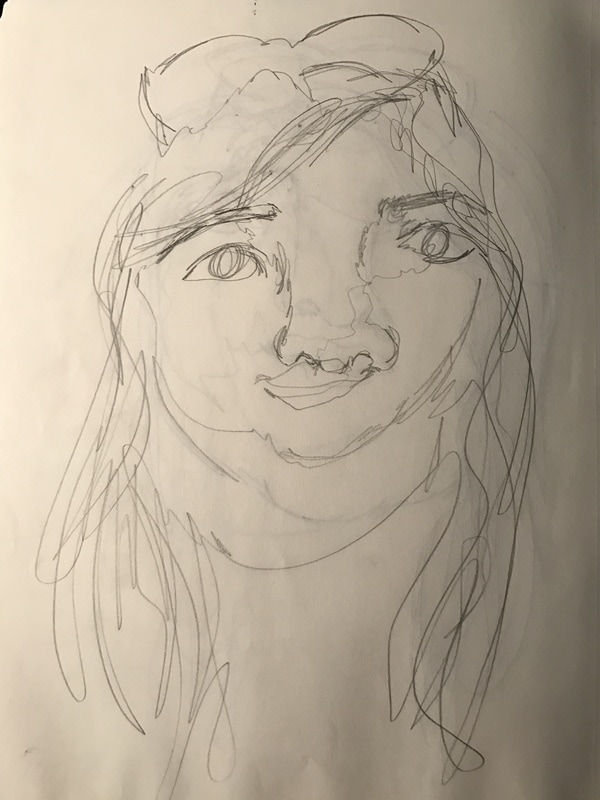
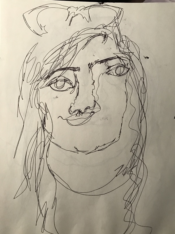
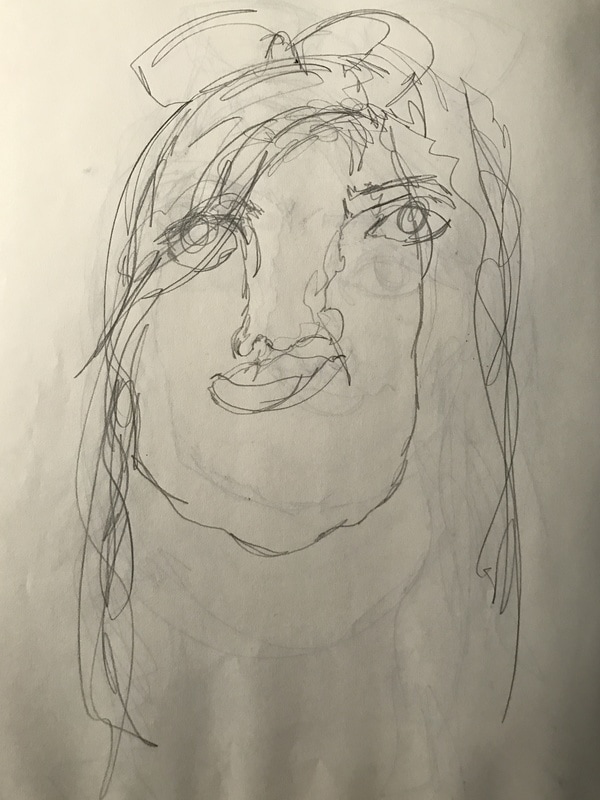
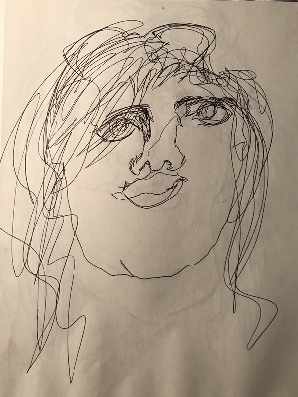
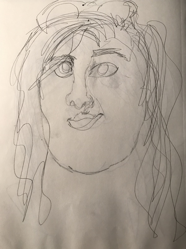
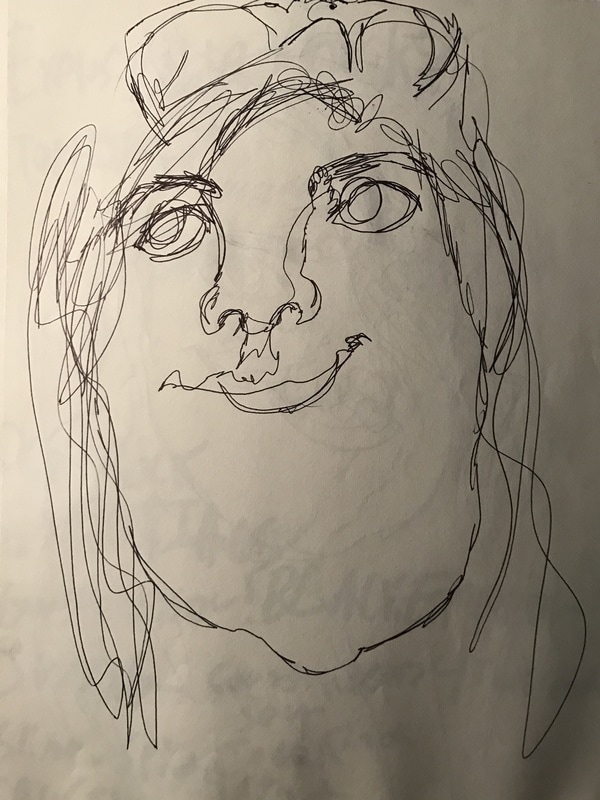
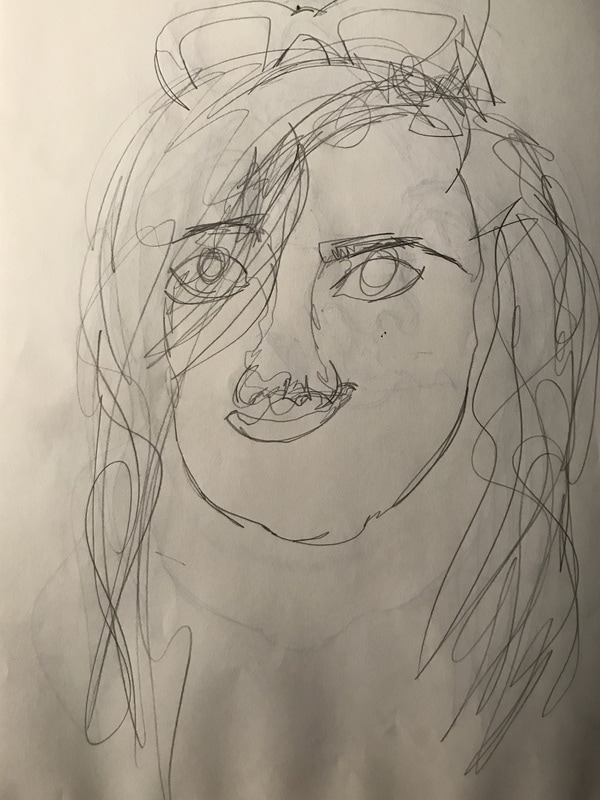
Above is the edition of blind contour drawings we did in preparation for the final painting. 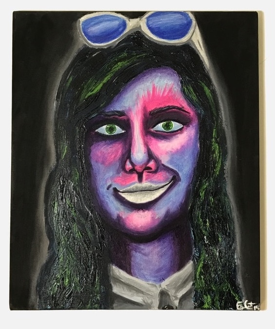 For this painting we made several blind contour drawings in order to pick out a feature of our faces to accentuate. The feature that stood out the most for me was my smirk so I decided to keep them very pale in order to strike a balance between the face and shirt. It also provided a nice bit of contrast and emphasis on the lips in comparison to the rest of the face. The painting style I used for this piece was completely experimental and I utilized several different techniques while working. The hair was applied with a palette knife whereas the rest of the painting was done with dry brushing and an interesting attempt at watercoloring with acrylics. For our critiques of this painting we were told to choose a song that we felt related to us and or our paintings to play while we presented our finished works. The songs I chose were Toxic- Britney Spears, which was in relation to the painting itself and Teen Idle- Marina & the Diamonds which was in relation to myself as a person. The painting as a whole made me think of the snippets in Toxic that were grabbed from an Indian soap opera and the color palette is also reminiscent of hazardous waste. I personally relate to Teen Idle because my aesthetic is very strongly the exact brand of emo/goth pop that, that particular song oozes.
 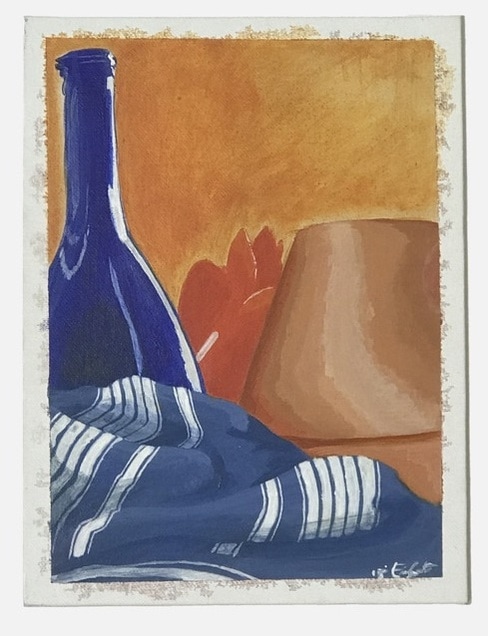 For our third painting we had a choice between three complimentary compositions to base our paintings off of (Blue & Orange, Red & Green, and Purple & Yellow). I chose to go with blue and orange because the objects in the still life seemed to present the most interesting challenges. I was excited for the chance to paint fabric for the first time and to this day I'm pretty proud of my efforts. The contrast between the bottle and the terra cotta pot regarding surface texture was also very fun to play around with. By the end of the painting I had developed a pretty good understanding of the way that light reflects off of different surfaces and how to represent it in a painting.
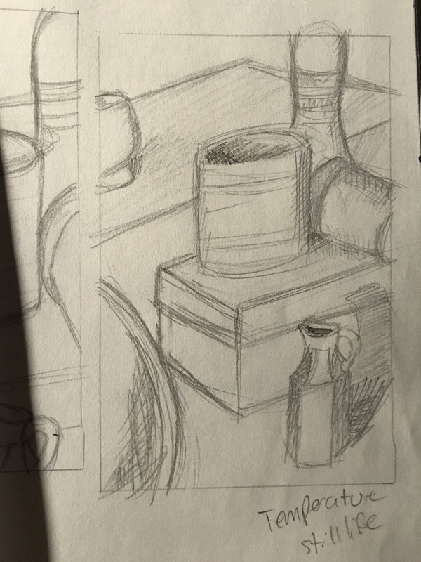
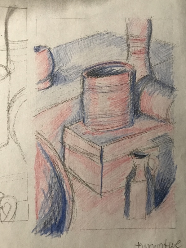
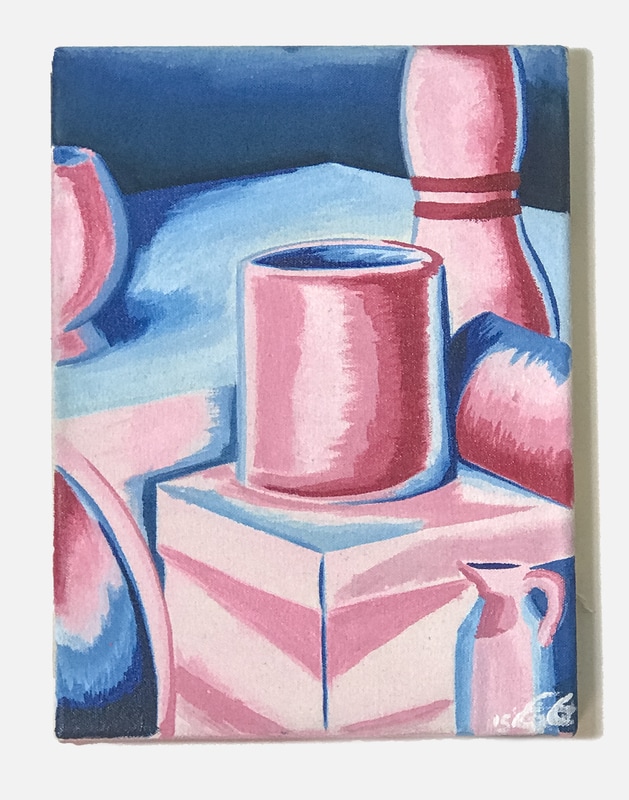 For the temperature painting we were instructed to show areas of light on the still life with a warm color (like red) and areas in shadow as cool colors (like blue). The goal was to further our understanding of utilizing different colors rather than black and white to show shadows and light.
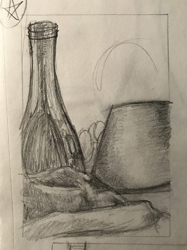
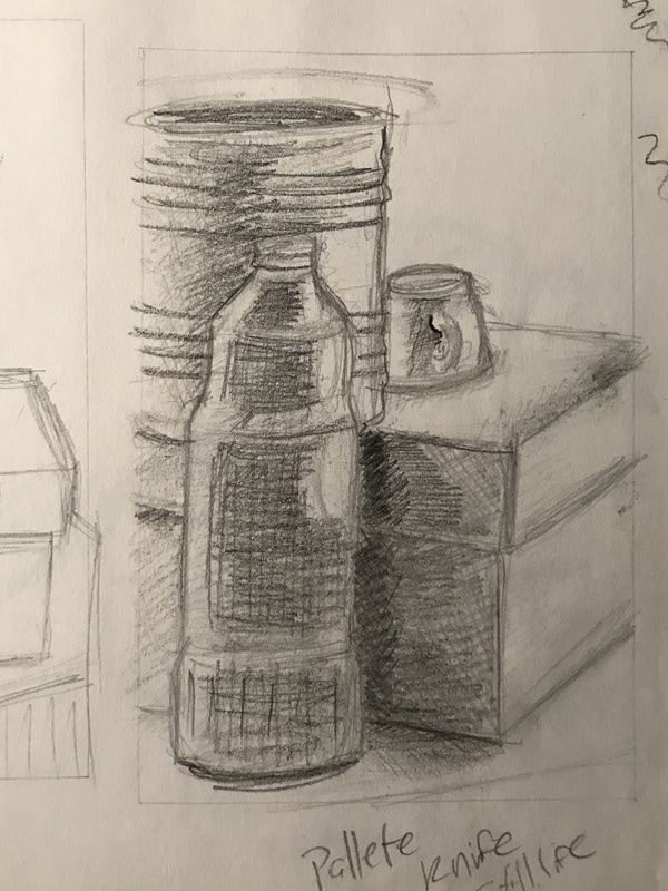 Even in my sketch its way to see that I didn't make the darkest areas of the composition black. 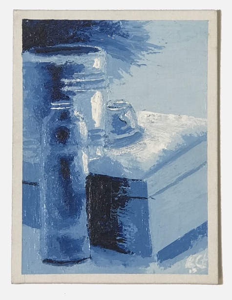 This was our first painting in Intro to Painting, requirements having been to choose one color to do the entire painting in and to use only a palette knife for the application of paint. Other than the complications associated with painting with a palette knife, I struggled the most with using dark, dark values. I tend to shy away from intense dark areas in my art and I think that really shows through in this piece.
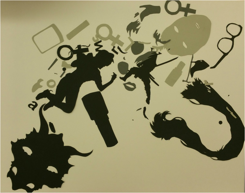 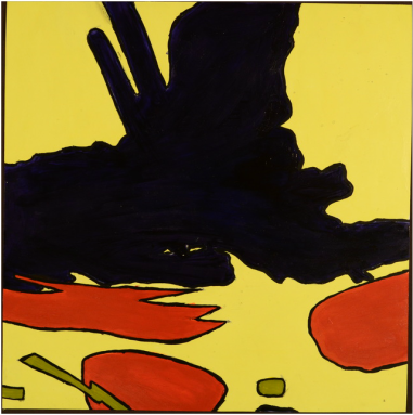 For this project I selected a very small area in the center of my original collage, focusing mainly on the samurai figure. In cropping my composition an entirely new image has been created and it almost can't be recognized as a part of the original work when rotated at a different angle. I chose a triad color scheme with the colors red-orange, blue-violet, and yellow-green. Using these colors has shown me that maybe only certain tints and shades of these colors work well together, as I feel I missed the mark with my color choices in this particular painting. Also, maybe having more of a variety would have made the piece more interesting rather than just keeping the same uniform colors throughout, or even utilizing the background for the shapes created on it rather than just as a solid backdrop for the rest of the shapes.
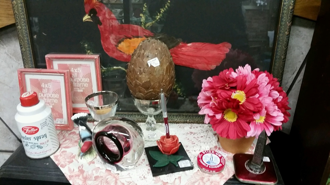 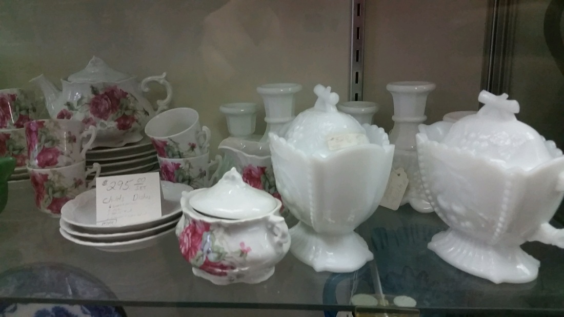 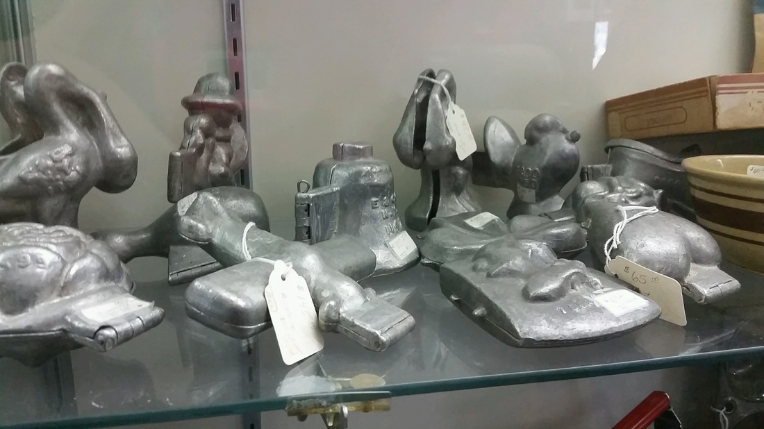 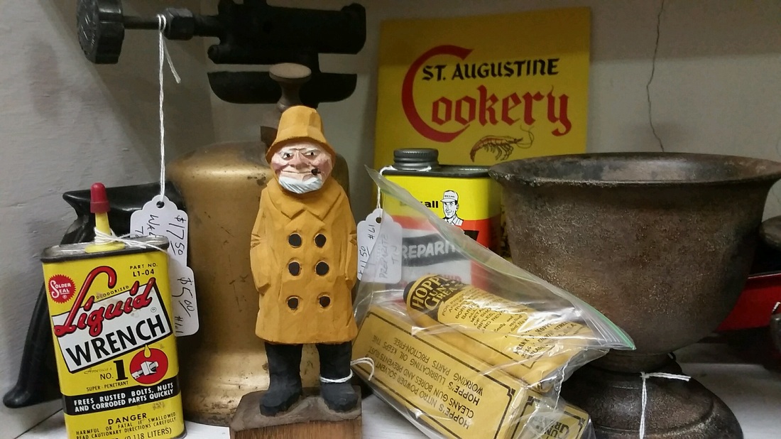 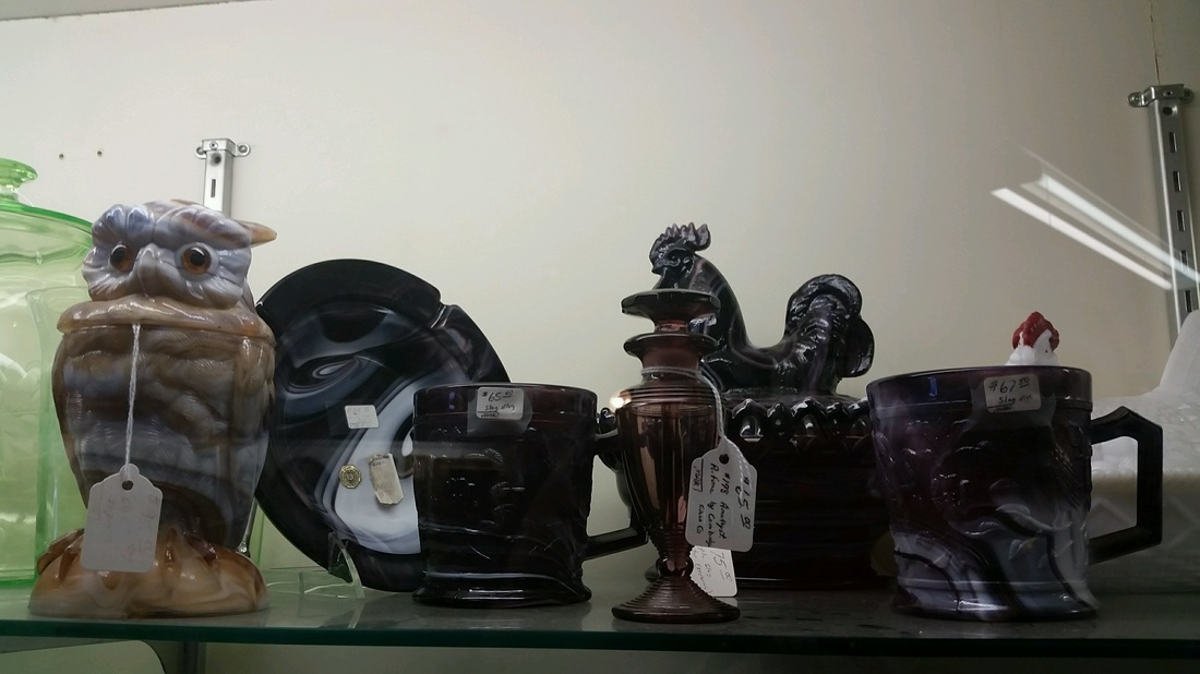 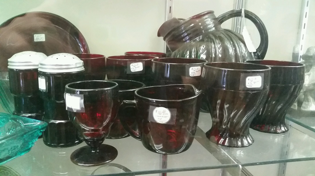 For these photos I went to the Blissfield antique mall and arranged various objects I found into monochromatic color groups. I chose to do a monochromatic color scheme because it was moderately easy to find objects of the same color near each other and I wanted to work quickly in order to avoid the prying eyes of the store owner. He's a conservative and makes me uneasy so I wanted to avoid any conflict with him.
|
Emily CuetoHeyyo, I like Paramore. Archives
March 2017
Categories
All
|
 RSS Feed
