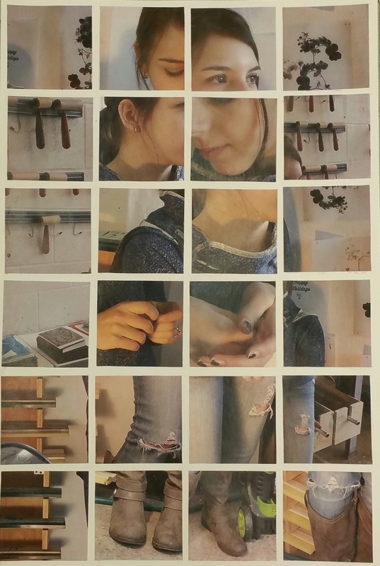
 This assignment was actually the first one we completed in Art 107, I had just completely forgotten to post it. The transition back to school from Christmas break proved more difficult than expected. This project was inspired by David Hockney's Joiners. We first began by partnering up and heading out to go take pictures of each other in different parts of the art building. We were to take the photos using dramatic lighting and a moving subject to show the passing of time. My partner Hannah and I took our photographs in the printmaking studio which has a lot of natural lighting. This made is slightly difficult to make our created lighting all that dramatic. After getting our photographs and choosing the 40 we liked best we re-sized the images and transferred them to a photoshop file, from which we printed them. Lastly, we arranged and glued down the images onto a piece of thick paper we had drawn a grid out on earlier. The results of this project were really interesting and I enjoyed seeing the distortions of the figure in everyone's collage.
0 Comments
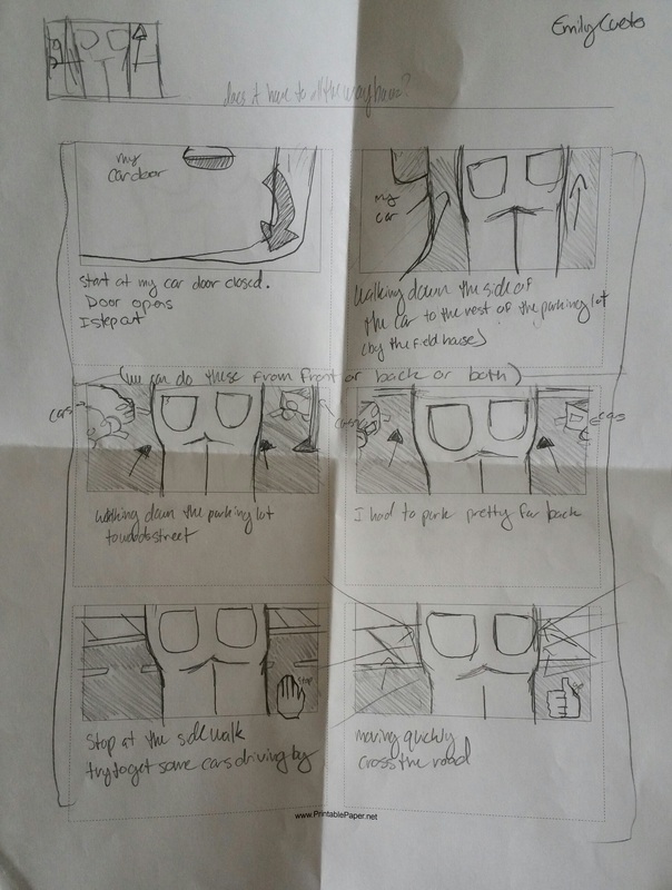
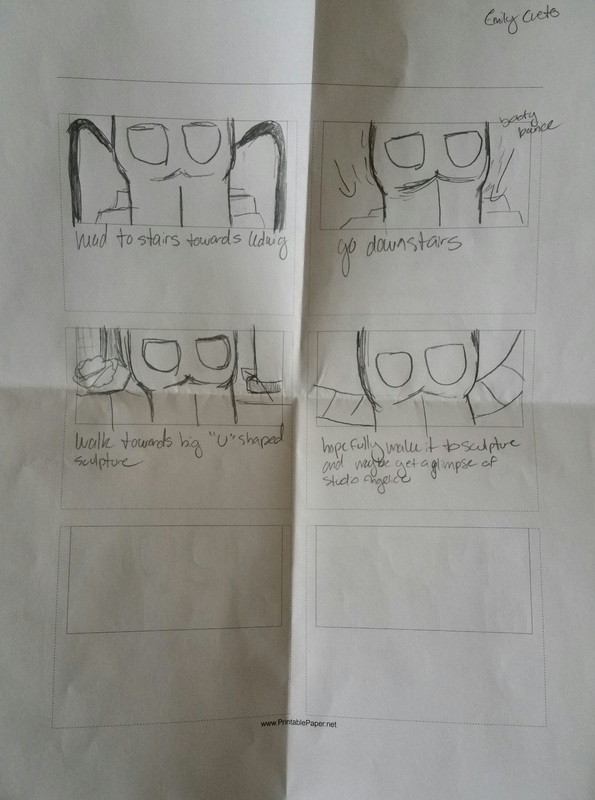
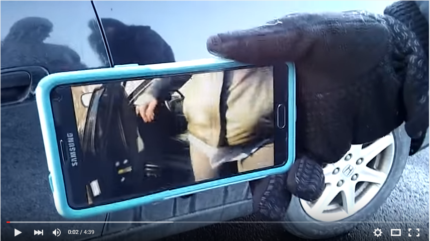 A screenshot of the beginning of our trip across camps. (final version) For this version of the Exquisite Corpse we attempted to create the figure using video clips of the body in motion. The concept was inspired by Vito Acconci's Following pieces, Janet Cardiff's Alter Bahnhof Video walk, and the surrealist movement. We were first drew a segment of the body that would be focused on in the video out of a hat provided by Mad. (I received the butt and thighs) We then made quick storyboards (pictured above) depicting the route we would be filming. After completing my storyboard I made a trial video of my route to get a better idea of what I wanted in the shot and to make sure that it would take at least 4 minutes to walk. After showing this to my partner we shot the first video, with my butt and thighs center camera. We then (after dealing with my phone battery) re-shot the route but this time with my camera playing the first recording as the main subject. This process was challenging for several different reasons and I'm not completely satisfied with the end product, but I love the concept and might decide to revisit this method of filming in the future. These video segments will be played on four monitors stacked upon each other in the gallery.
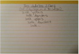
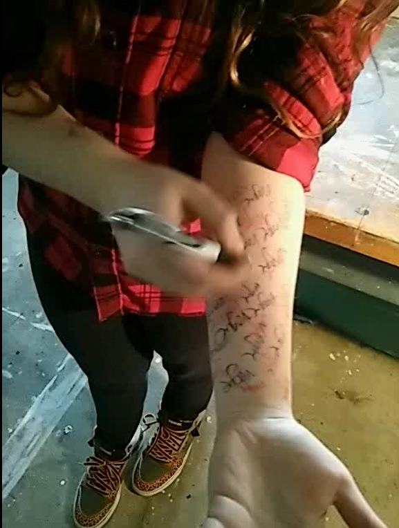
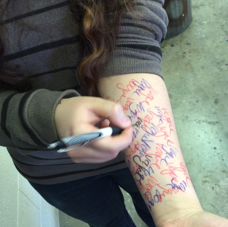
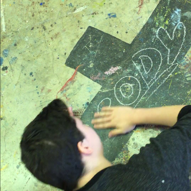
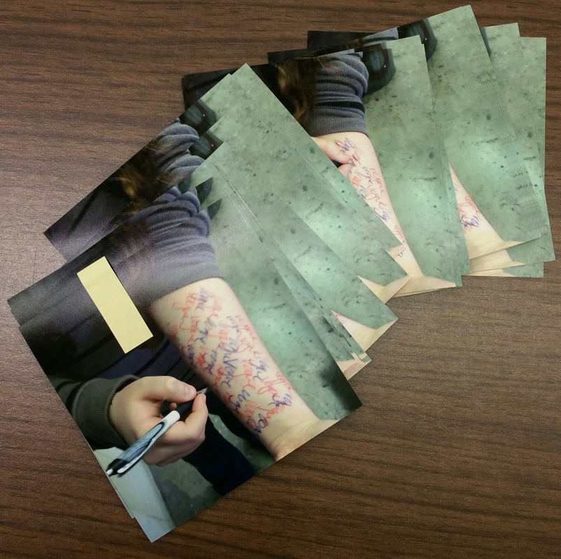
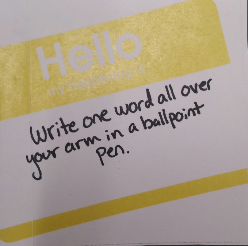
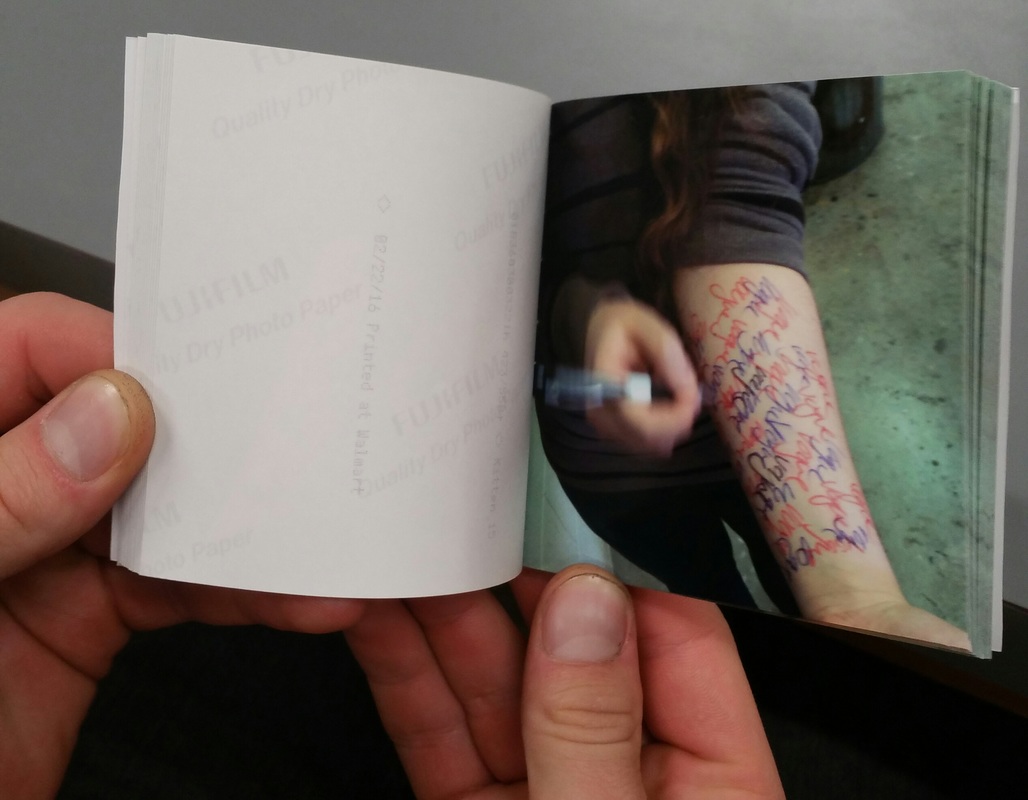
Above are the original poems I made based on the work of Yoko Ono which focus on daily actions rather than actions that would have been used for mainly artistic purposes. Though since I missed a day of class the action I used was one provided by Peter; "Write one word all over your arm in a ballpoint pen."
The still images from these animations will be used in a flip book we will be making later on in the semester. The download links to the animations are included below.
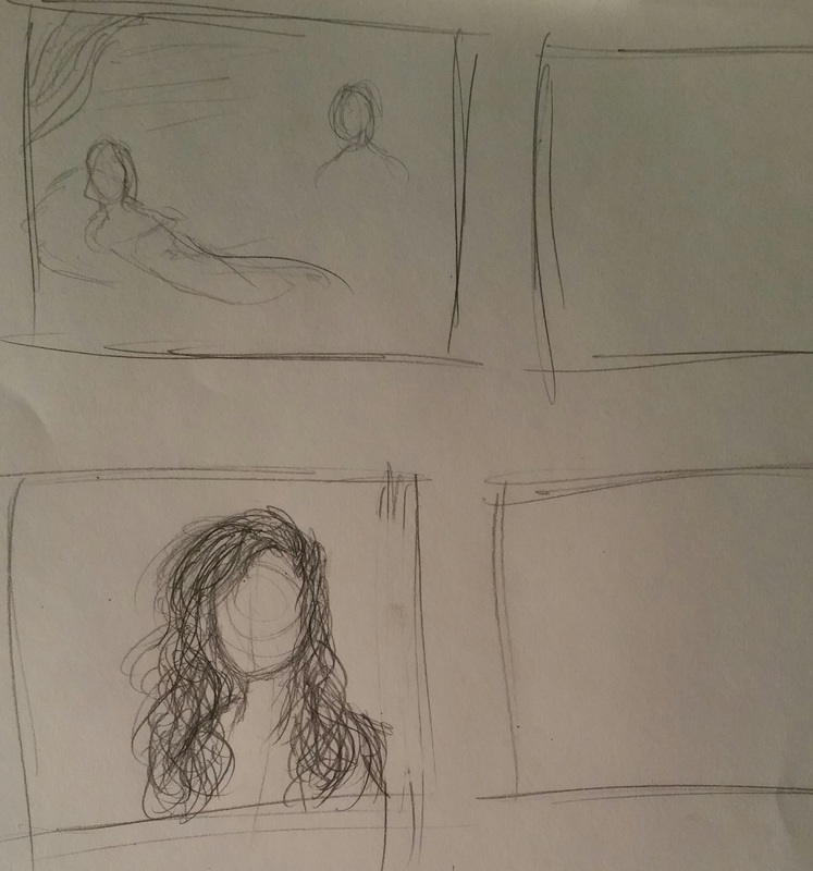
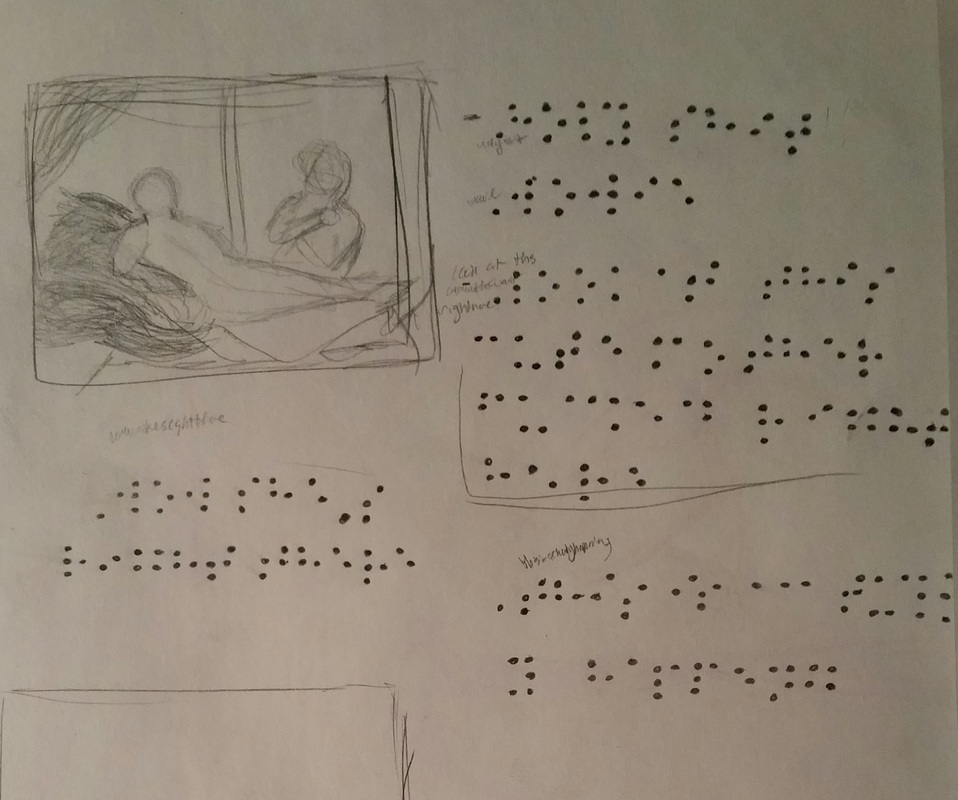
  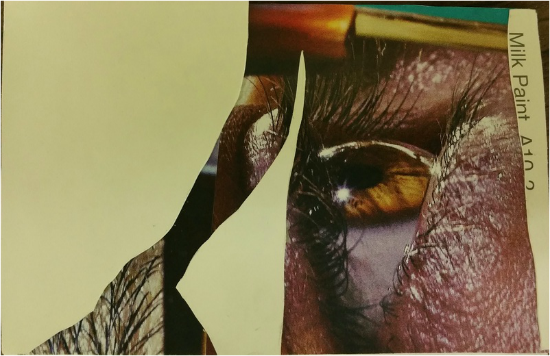 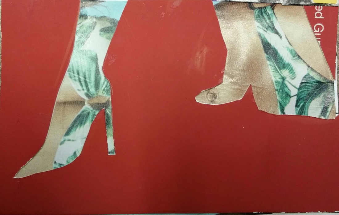 For this project we sought inspiration from John Stezaker and the surrealist movement, specifically that of a common party game called the Exquisite Corpse. It was a collaborative project with one section of our body made by us and the other three by three different classmates. This basically gives the original artist no control over how the finished work will look (aside from the one panel they made themselves). We explored the use of complimentary colors with the figure and ground as well as the use of uncanny imagery.The uncanny images were the hardest to wrap my head around but I feel like I got the hang of it by the end. I even found something I liked in my first and least favorite panel I created, I made my figure a butt-head. Above are the panels I made myself and below is the collaborative exquisite corpse made by myself and three others. 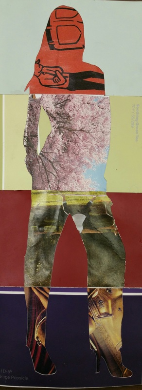 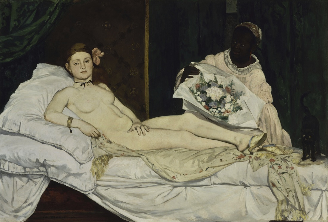 Édouard Manet, Olympia 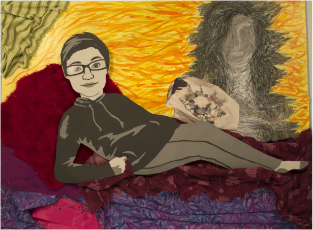 For my reinterpretation of a historic painting I decided immediately that I wanted to use “romance” and “ecstatic” for my theme and adjective that would expressed through my artwork. I chose these two words once I found out the work had to relate to us personally, and one of my favorite things to do is talk about my relationship. The painting I chose to reinterpret is Édouard Manet, Olympia, which I chose solely because it had a pair of ladies posed in a vaguely romantic stance. My chosen personal experience for this project was the first time I had ever met my girlfriend in person, so a painting of two women was more than enough for me to work with. I chose to use three different color schemes in my work, the first being various tints and shades of pink and purple for the romance aspect, yellow and orange for ecstatic, and grayscale for the main subjects of the piece. I have my main form, Jasmine, lying on top of the fabric layered together to create a couch and pillows. I wanted to make the couch warm and loving because those were vibes I felt coming off of her the moment she walked out of the bus station. The orange and yellow that seem to be bursting off of me are an accurate representation of what my mind was experiencing in this moment. There was a blissful, surreal feeling of joy and shock that just seemed to hit me all at once and I felt this was best expressed with bright, warm colors. As for the two figures I went with grayscale because I wanted to show that we were both people in the same situation, thinking and feeling the same things, and yet handling them in two completely different manners. When we saw each other Jasmine kept it pretty cool; she smiled broadly and kept mostly quiet. This made her stand out more than anything else around me; I’d never seen anyone or anything more clearly than I saw her in that moment, which is why she is so realistically cut out of paper. I on the other hand had immediately broken into a cold sweat, thrown up in my mouth, and started shaking uncontrollably. I couldn’t form a comprehensive thought and stuttered out every word I tried so desperately to get out. I wanted to show my state of disarray and ecstasy through the use of expressive line to create a vague silhouette of myself. Lastly, I placed some subtle braille code throughout the fabric of the couch that can be translated into some of the thoughts that were buzzing around my head, such as; “Wowie!” and “This is actually happening!”
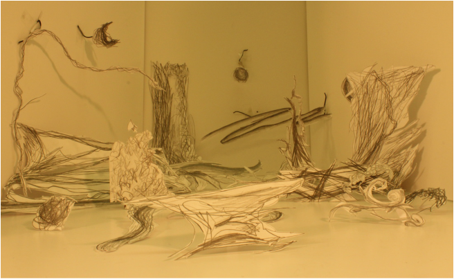 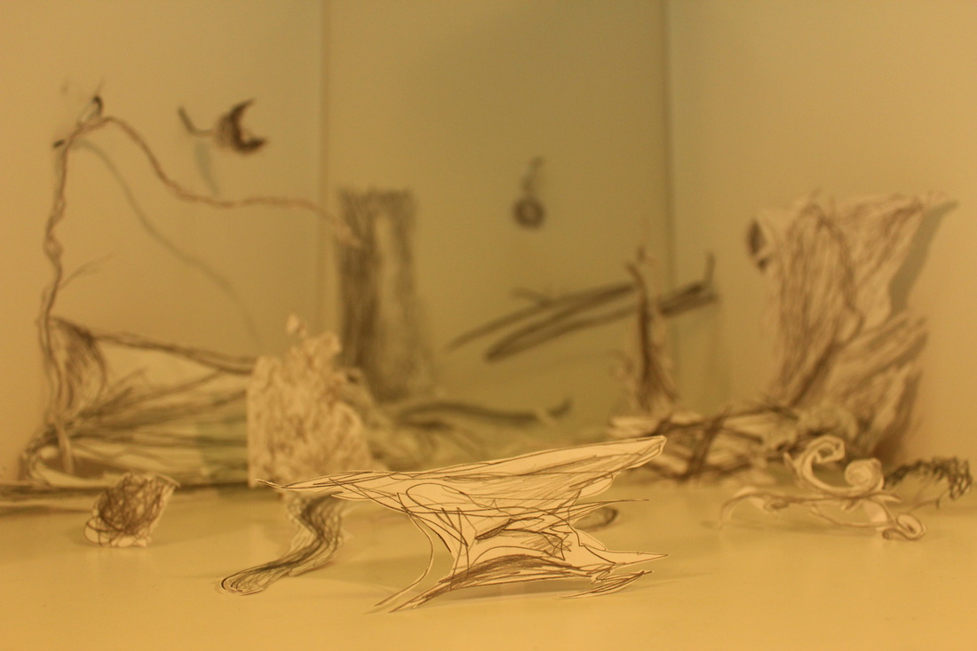 The two different expressive words I chose to focus on in this project are overgrown and decrepit. The main goal of this project was to give us experience with creating a 3-D work of art out of expressive, non representational, 2-D images. I attempted to make my shapes resemble a cluster of ruins and scrap metal, shown by the rectilinear shapes and hard edges, that has been once again overtaken by nature, shown by the multiple organic forms. While I am satisfied with the end result of this project I feel like it could be revisited with more shapes on the walls and just throughout the whole composition.
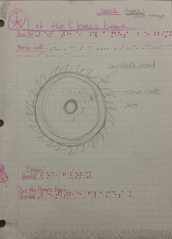
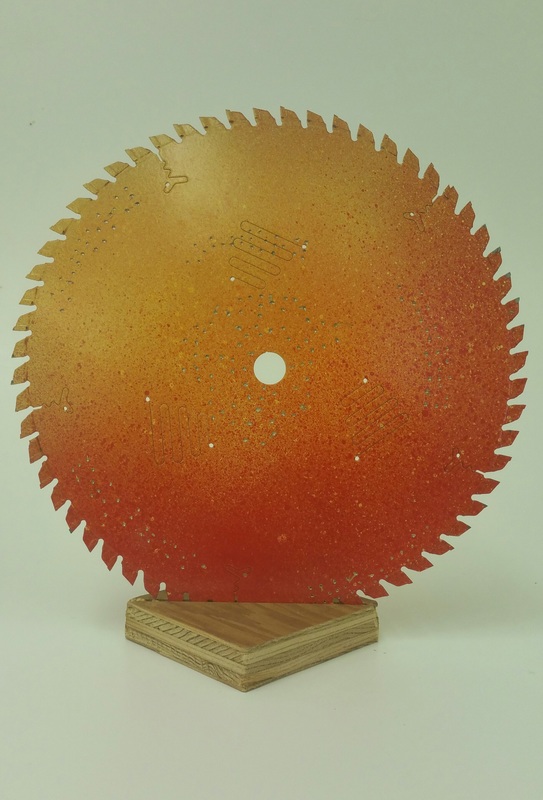
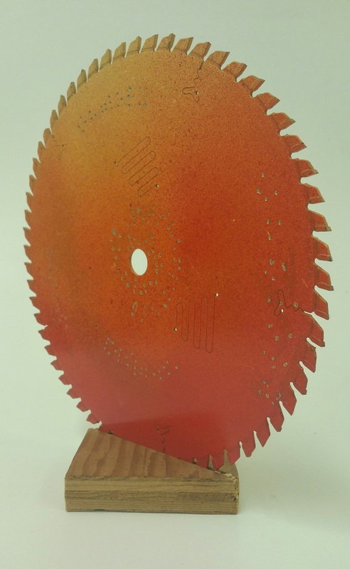
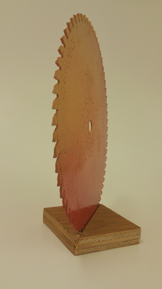
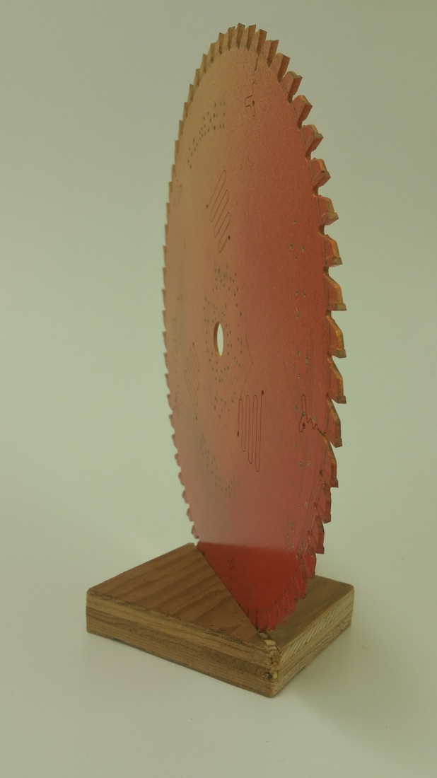
Let The Flames Begin - Paramore
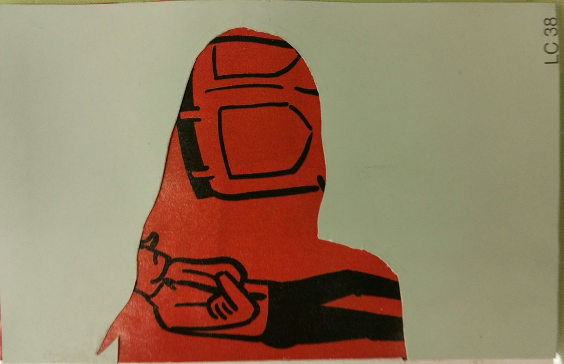
Lyrics: "Let the flames begin" + "Oh glory" For this project I focused on the themes "Power" "Change" and "Control". I used a saw blade, a dremel, spray paint, and braille in order to create this mildly dangerous record. The individual dots that make up the braille characters represent my chosen themes better than any other aspect of the piece. It took a great deal of power in order to carve those dots into the blade, as is made of stainless steel. (I even had to go buy a new heavy duty dremel bit) If you look closely, you can see gouges that shoot off from some of the dots, and while these were admittedly unintentional, I feel accurately show the relationship between power and control. When you use too much force, or power, you begin to lose control and you disturb the harmony of the group as a whole. With too much control and not enough power, there would have been no way the dots would have gone deeper than under the layers of spray paint that coat the blade. Change is the most abstract theme in this piece but I feel like the most effective way to make change happen is by having an equal balance of power and control. 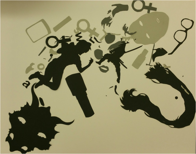  For this project I selected a very small area in the center of my original collage, focusing mainly on the samurai figure. In cropping my composition an entirely new image has been created and it almost can't be recognized as a part of the original work when rotated at a different angle. I chose a triad color scheme with the colors red-orange, blue-violet, and yellow-green. Using these colors has shown me that maybe only certain tints and shades of these colors work well together, as I feel I missed the mark with my color choices in this particular painting. Also, maybe having more of a variety would have made the piece more interesting rather than just keeping the same uniform colors throughout, or even utilizing the background for the shapes created on it rather than just as a solid backdrop for the rest of the shapes.
|
Emily CuetoHeyyo, I like Paramore. Archives
March 2017
Categories
All
|
||||||||||||||||||||||||||||||||||||||
 RSS Feed
