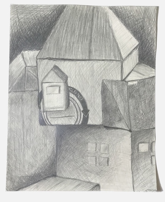
 For this assignment we created a still life town out of cardboard buildings. Each student constructed a building of different size and then placed it somewhere on our community grid. This was purely a still life drawing after the creation of the buildings and was by far my least successful piece (as well as least favorite).
0 Comments
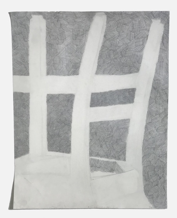 The purpose of this drawing was to render a chair using negative space rather than line work. We could use any form of shading or crosshatching to fill up the background and create a high level of contrast between the figure and ground.
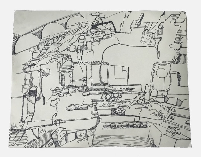 The second method we explored in Drawing Concepts was a contour line drawing based on various stills from the opening scene of Space Balls. We would pause the film for fifteen minutes and draw as much of the space ship that we could within the time frame without lifting our pens from the paper. We were encouraged to overlap lines and different sections of the ship and not to focus on making an image necessarily recognizable as a spaceship.
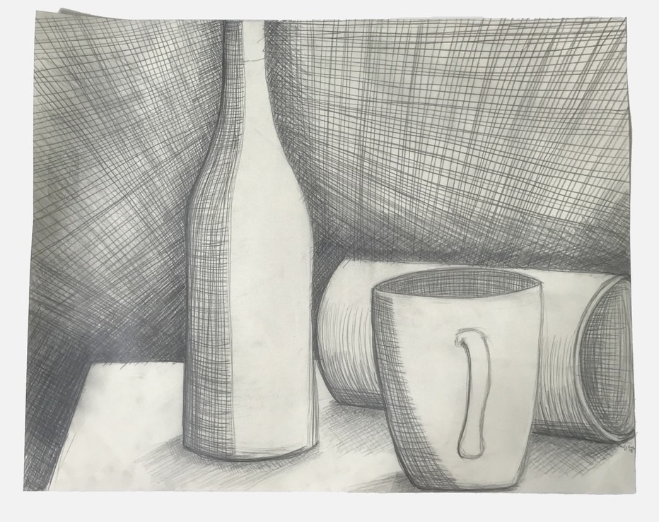 This is the first full sized still life we did in Intro to Drawing. We focused on the perspective and volume of objects in order to render a 3-D object in a 2-D drawing. This assignment was also used as an exercise to get comfortable with using crosshatching to follow the contours of objects.
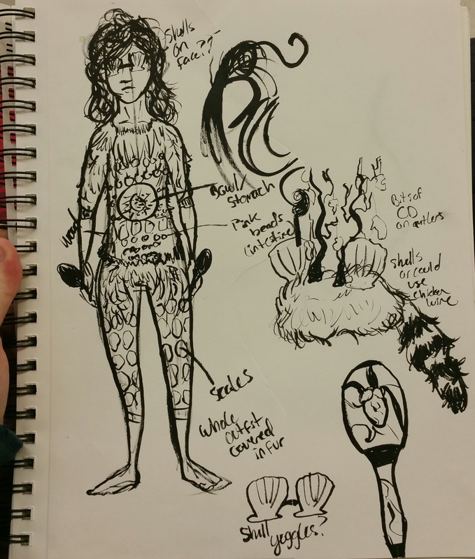
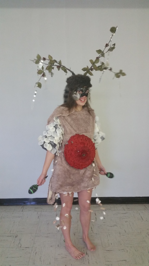
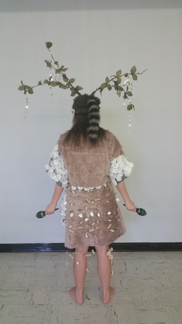
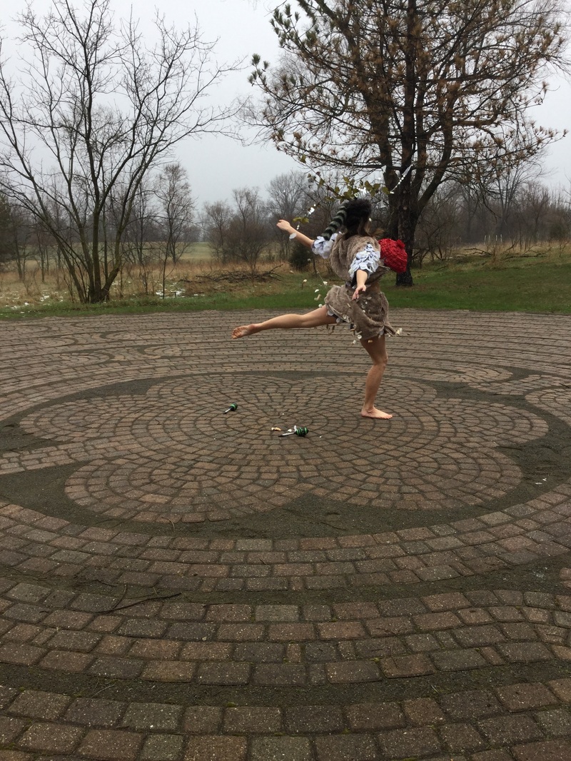
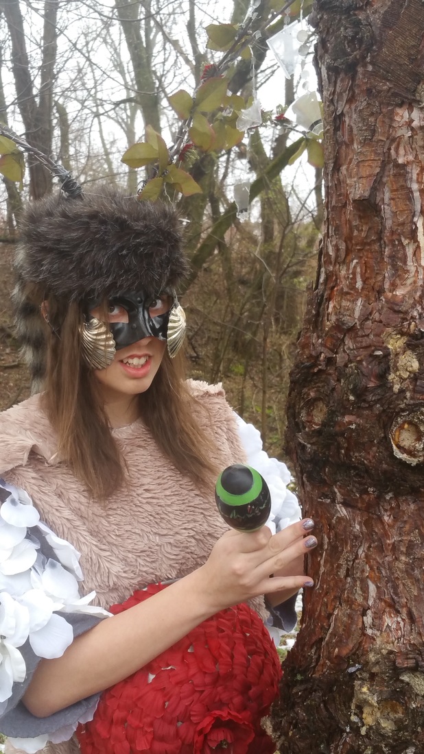
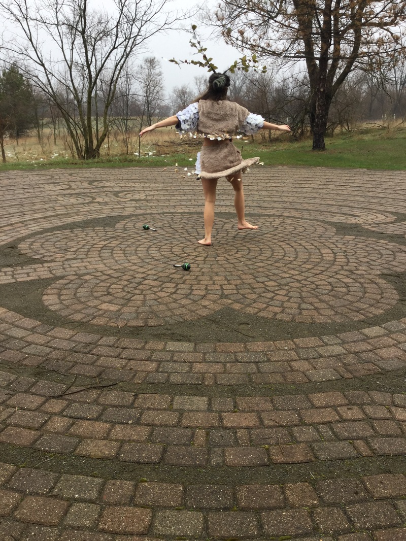
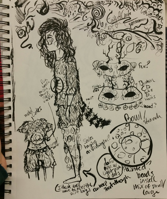
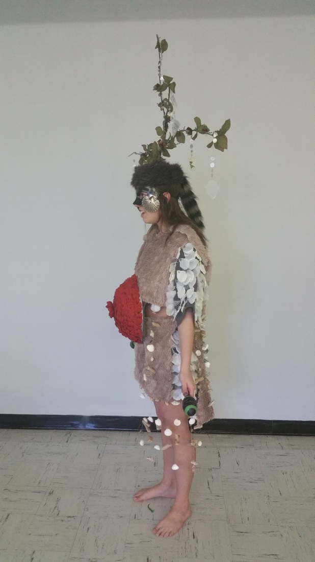
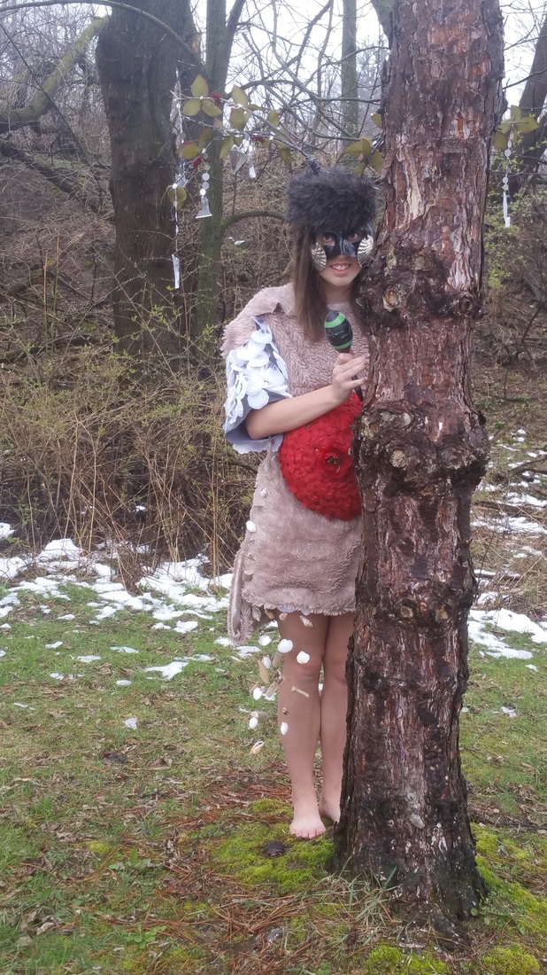
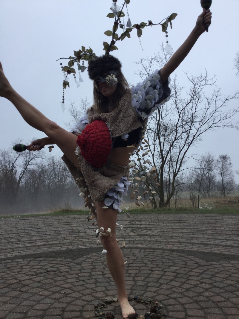
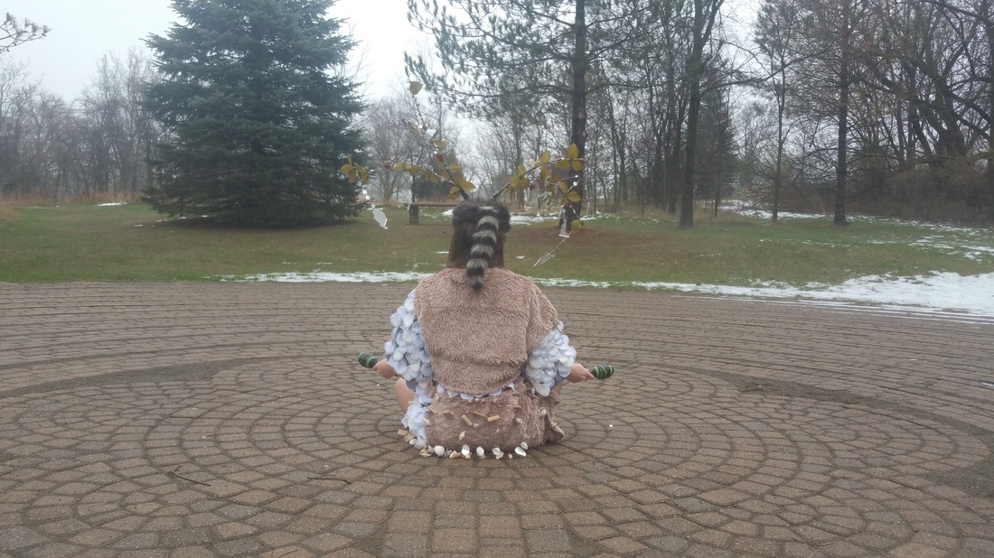
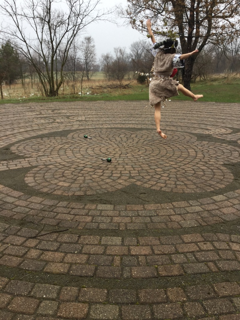
For this project we were assigned into groups of three and tasked with creating and then performing a body suit in the style of Nick Cave and Jana Sterbak. We also had to include one word from each element of the Wu Xing chart. The words we chose from each element were: Wood: Scaly, Fire: Pulse, Earth: Stomach, Metal: Furred, and Water: Shelled. We went with the aspects of each element that would come together best in order to create a sort of "forest spirit" character. The performance was really meant to show the balance and connection between body and nature. Alissa starts and ends the performance sitting on the ground and directly interacting with the natural energy or "pulse" of the world. Her actual dance is meant to be like the energy flowing through her and sort of guiding her movements. The dance is also cyclical, like Wu Xing, starting and ending with the same actions. We chose to film at the labyrinth because of the mystical vibes you get from being there. It's also far enough from campus that you can't see many buildings and it really feels like you're lost in nature for the time being.
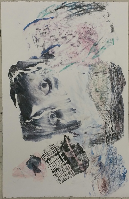
Solvent Transfer Montages on the Taoist Theme of Wu Xing and in the Style of Robert Rauschenberg4/6/2016
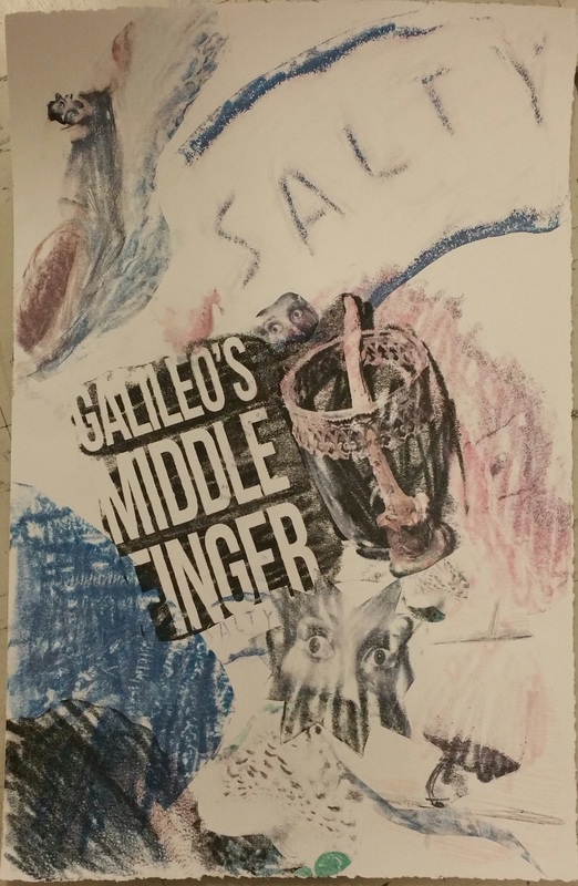
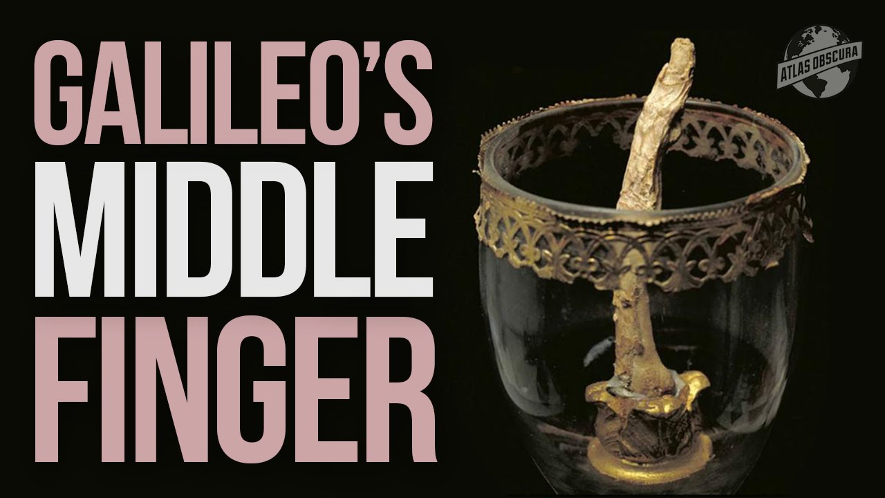
For this project we made our own Cirtisolv transfer prints in the style of Robert Rauschenberg and using influences from the theme of Wu Xing. The images used in the transfer are each related to a specific part of the five elements of Wu Xing; wood, fire, earth, metal, and water. The words associated to the elements I used in my prints are; Jupiter, scaly, sweat, scorched, saliva, middle finger, large intestine, nose, fear, and salty. This project was somewhat difficult for me since collage really isn't my strong point. It's definitely something I hope to improve on in the future since I love the results so much. Sources for all images used:
Mushroom: https://pixabay.com/static/uploads/photo/2015/11/16/09/47/mushroom-1045490_960_720.jpg Jupiter: https://pixabay.com/static/uploads/photo/2012/01/09/10/42/jupiter-11618_960_720.jpg Scorched: https://upload.wikimedia.org/wikipedia/commons/0/0f/DirkvdM_santa_fe_scorched.jpg Sweat: https://c1.staticflickr.com/7/6146/6032270876_7c2d297e6b_b.jpg Middle Finger: https://i.ytimg.com/vi/hC2yvfiOC7c/maxresdefault.jpg Crystal Spit: https://upload.wikimedia.org/wikipedia/commons/1/12/Allismicro_crystalized_saliva_8.jpeg Large Intestine: https://i.ytimg.com/vi/a2Z_oj-kPME/maxresdefault.jpg Nose: https://upload.wikimedia.org/wikipedia/en/thumb/e/ef/St_Pancras_Nose.jpg/359px-St_Pancras_Nose.jpg Salt: https://i.ytimg.com/vi/imTr8Vhe9HU/maxresdefault.jpg Fear: https://upload.wikimedia.org/wikipedia/commons/c/c2/COS_09.JPG
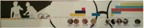
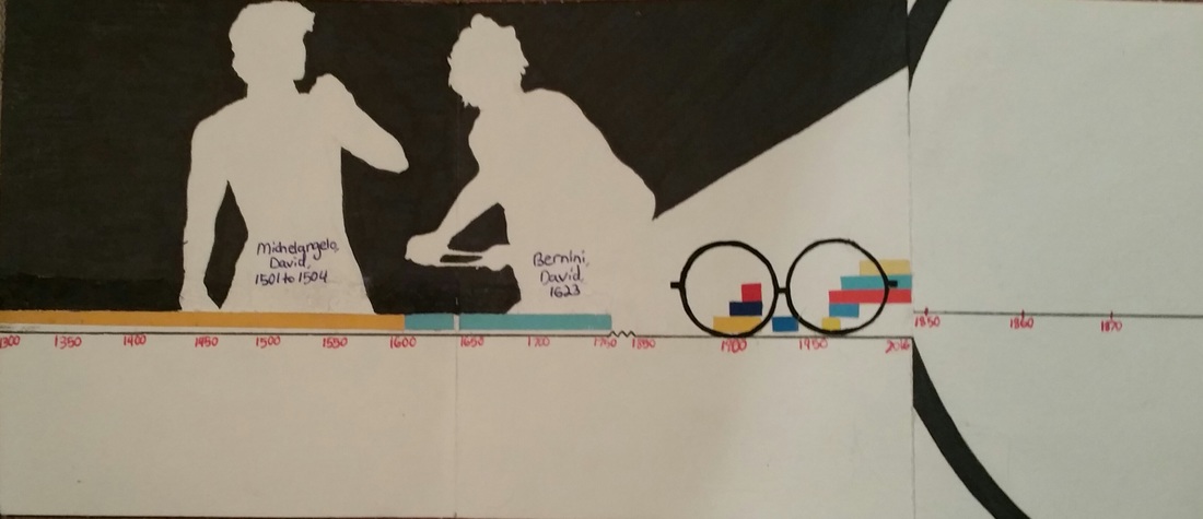
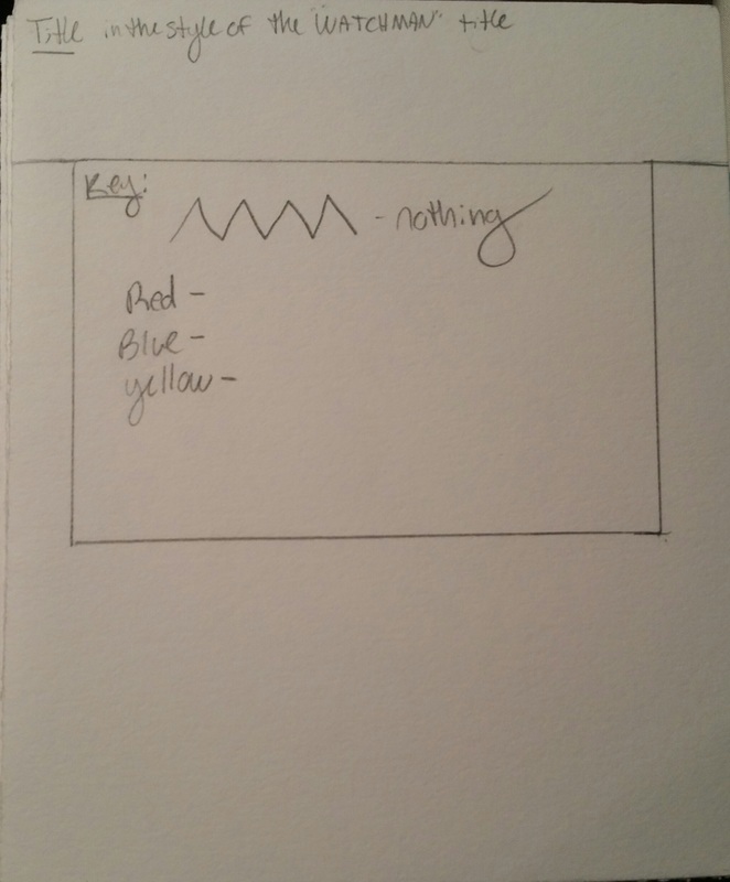
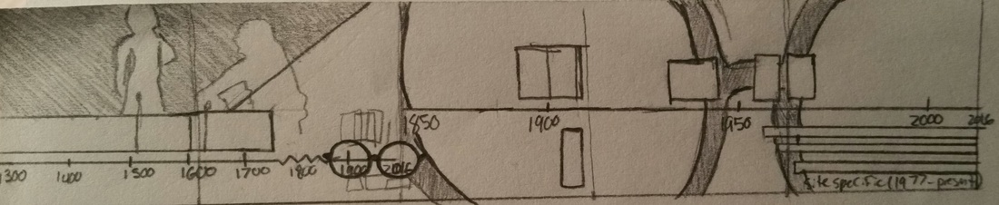
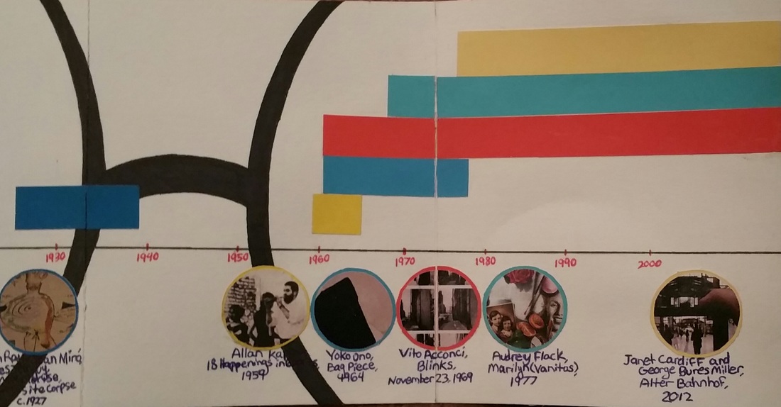
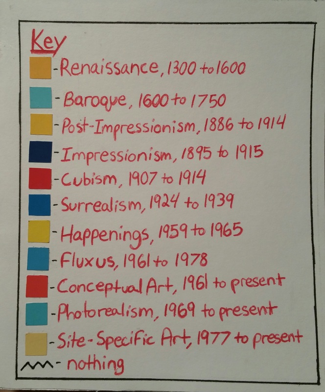
Here is the original sketch and finished product of the timeline key. For this project we each selected a graphic design artist from a list provided whose style we would be modeling our timelines after. For this project I chose Chip Kidd, the designer of the Jurassic Park logo. We cut a piece of stonehenge into three pieces for our first draft, final product, and an extra sheet to use in case of any mistakes made. It was very difficult for me to visualize what the design would look like laid out, and I think that's pretty clear to see in my first sketch. Meeting with Mad and Peter really helped me figure out what I was going to do with my timeline, and actually the glasses (which are my favorite part) was Mad's idea. I decided to use the silhouettes and primary RYB primary colors since they're two pretty prominent aspects of Chip Kidd's designs. All of the colors on the timeline and the small pair of glasses are cutout of coloraid paper that was provided to us. All of the rest of the black is Sharpie and the writing is just in pen. I decided put a key on the front of the book showing the colors linked with each art movement rather to label each rectangle on the timeline in order to keep it from being too crowded.
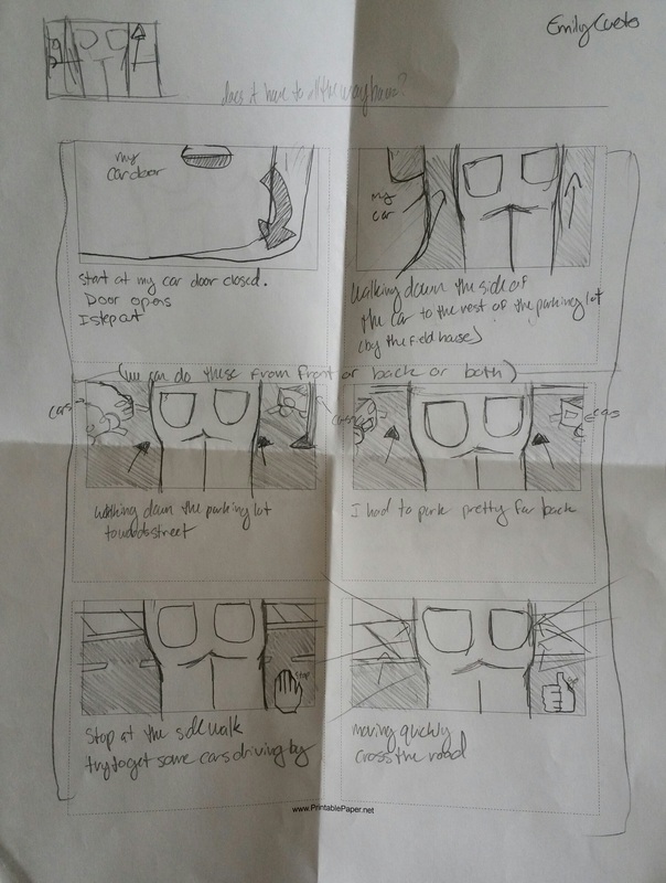
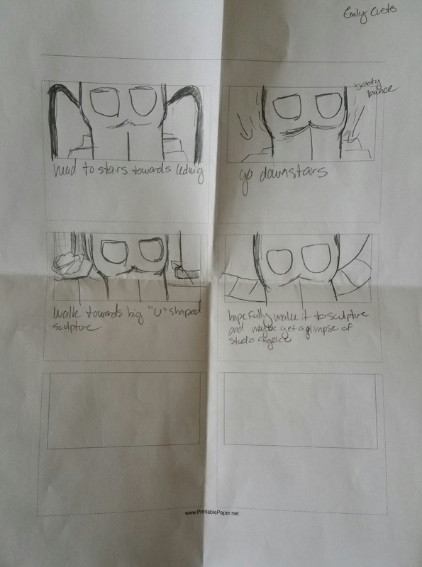
 A screenshot of the beginning of our trip across camps. (final version) For this version of the Exquisite Corpse we attempted to create the figure using video clips of the body in motion. The concept was inspired by Vito Acconci's Following pieces, Janet Cardiff's Alter Bahnhof Video walk, and the surrealist movement. We were first drew a segment of the body that would be focused on in the video out of a hat provided by Mad. (I received the butt and thighs) We then made quick storyboards (pictured above) depicting the route we would be filming. After completing my storyboard I made a trial video of my route to get a better idea of what I wanted in the shot and to make sure that it would take at least 4 minutes to walk. After showing this to my partner we shot the first video, with my butt and thighs center camera. We then (after dealing with my phone battery) re-shot the route but this time with my camera playing the first recording as the main subject. This process was challenging for several different reasons and I'm not completely satisfied with the end product, but I love the concept and might decide to revisit this method of filming in the future. These video segments will be played on four monitors stacked upon each other in the gallery.
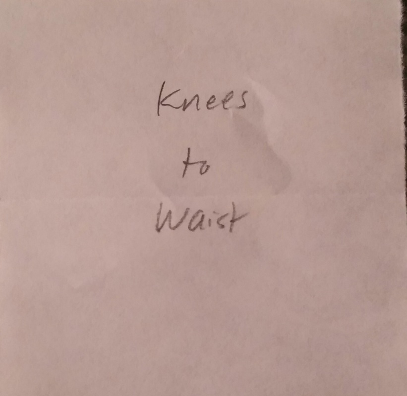
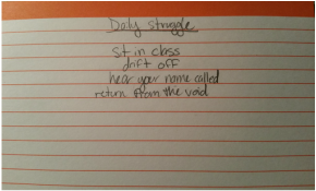
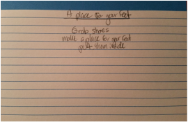
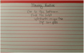
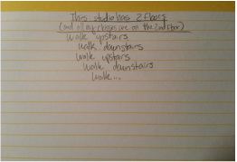
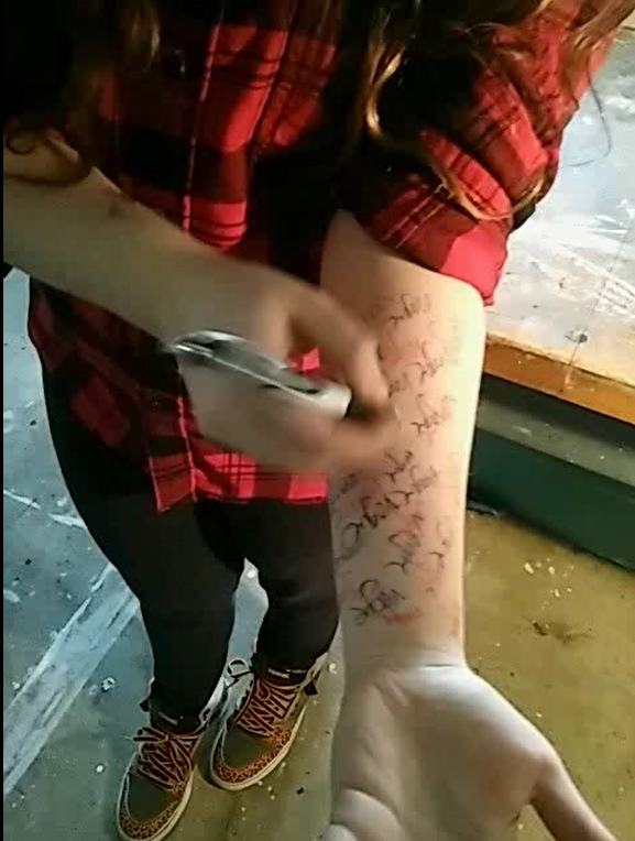
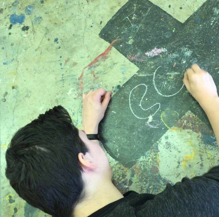
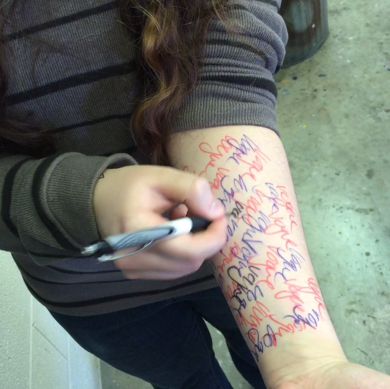
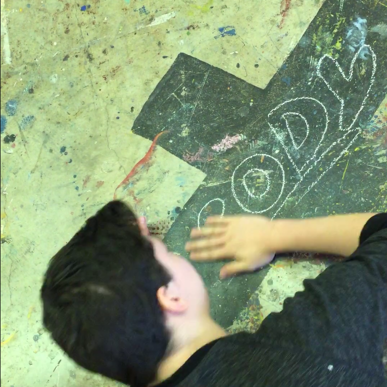
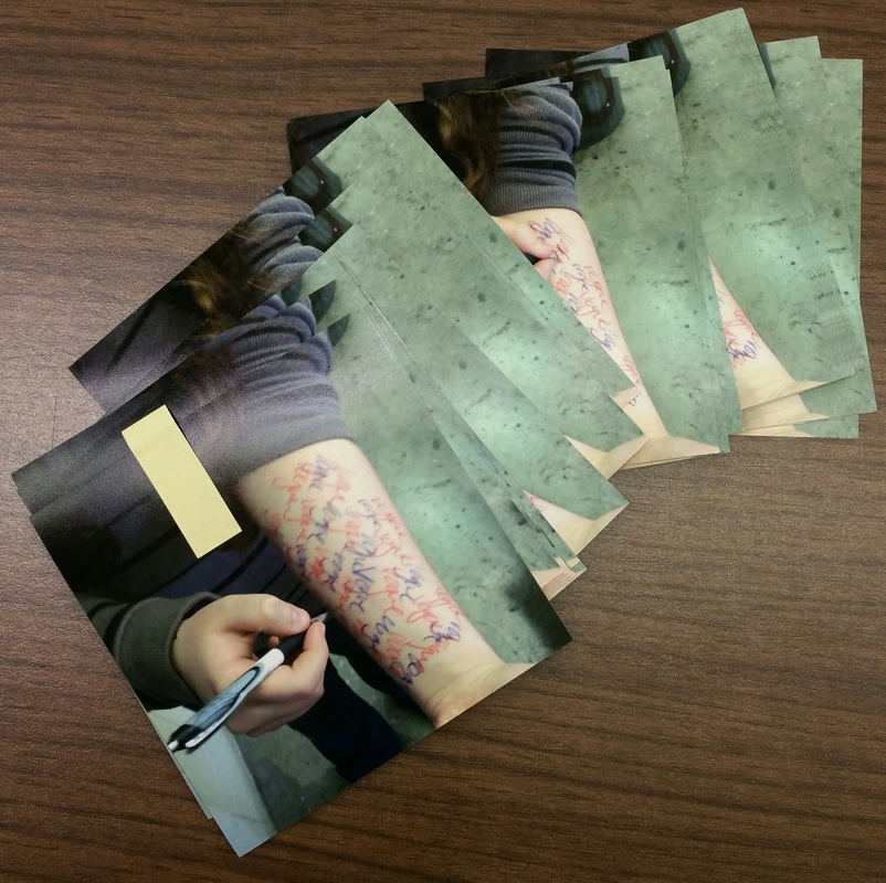
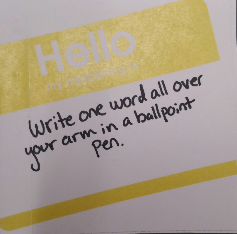
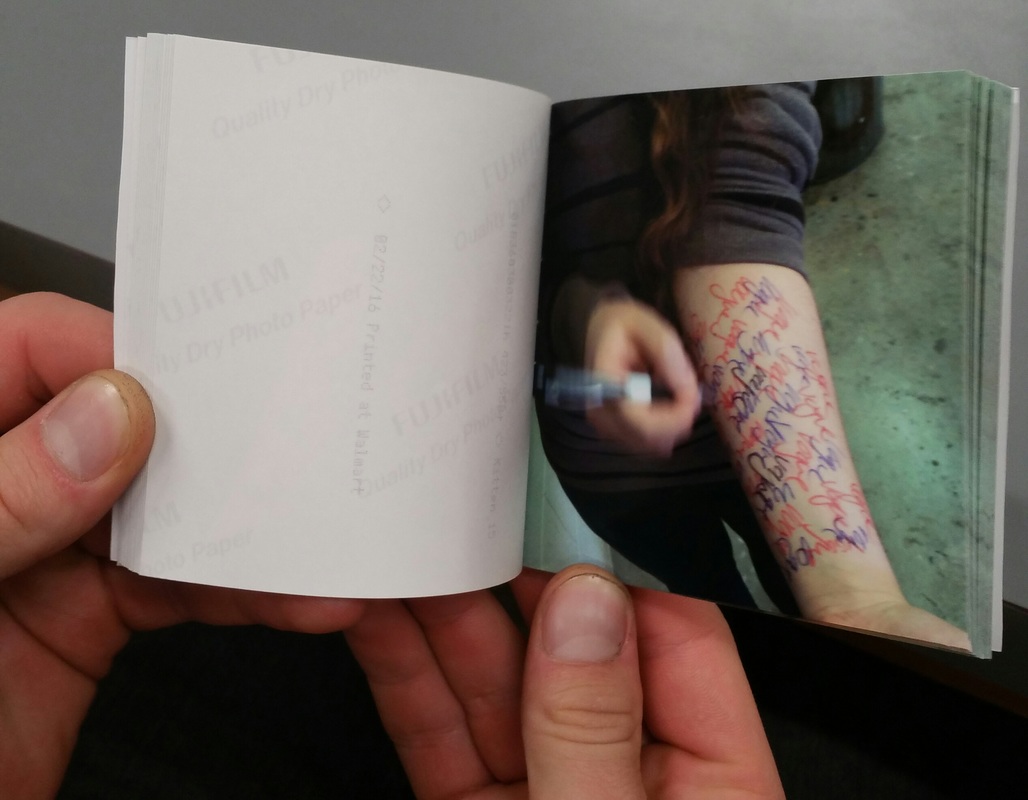
Above are the original poems I made based on the work of Yoko Ono which focus on daily actions rather than actions that would have been used for mainly artistic purposes. Though since I missed a day of class the action I used was one provided by Peter; "Write one word all over your arm in a ballpoint pen."
The still images from these animations will be used in a flip book we will be making later on in the semester. The download links to the animations are included below.
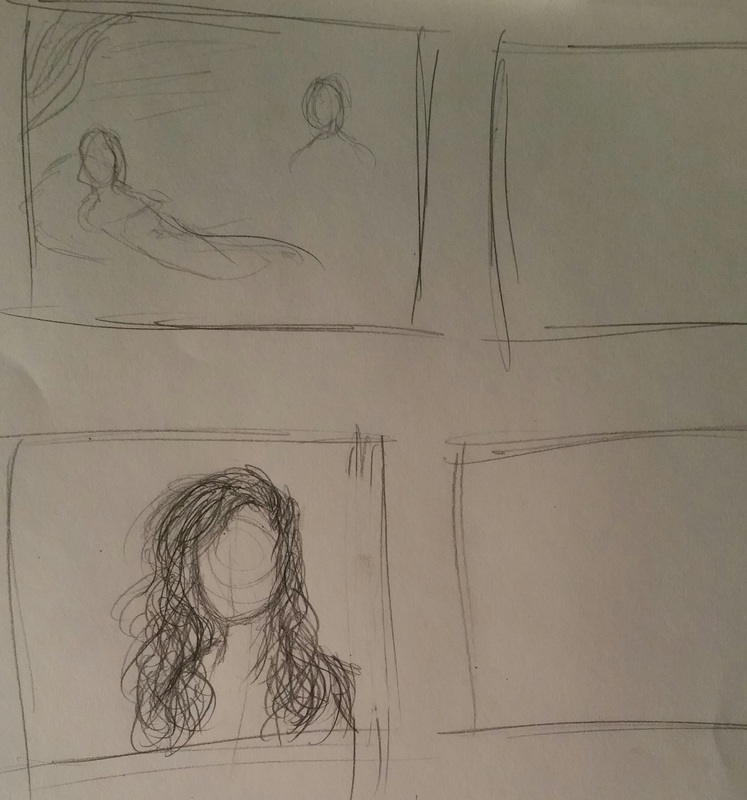
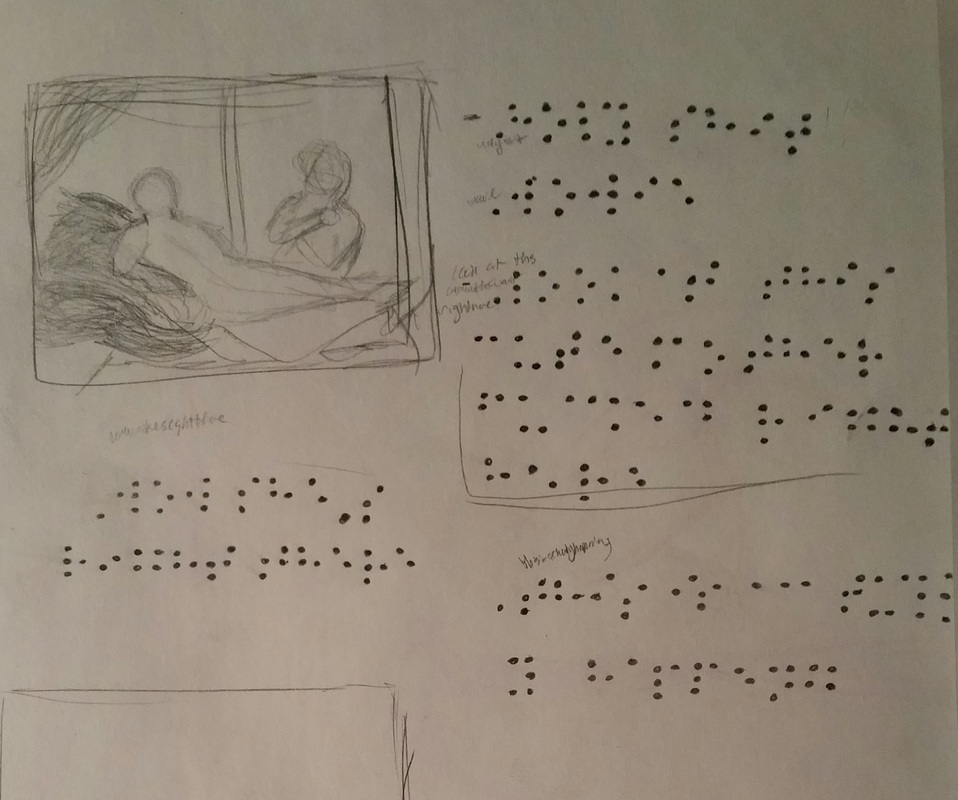
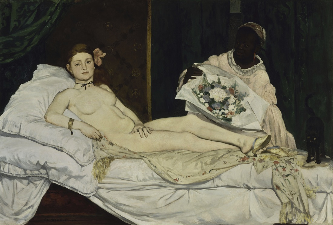 Édouard Manet, Olympia 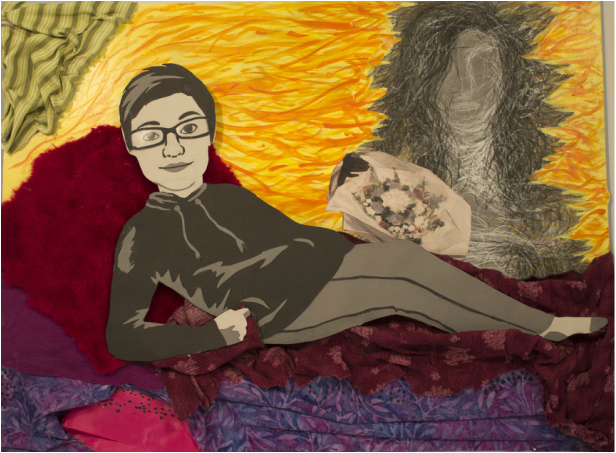 For my reinterpretation of a historic painting I decided immediately that I wanted to use “romance” and “ecstatic” for my theme and adjective that would expressed through my artwork. I chose these two words once I found out the work had to relate to us personally, and one of my favorite things to do is talk about my relationship. The painting I chose to reinterpret is Édouard Manet, Olympia, which I chose solely because it had a pair of ladies posed in a vaguely romantic stance. My chosen personal experience for this project was the first time I had ever met my girlfriend in person, so a painting of two women was more than enough for me to work with. I chose to use three different color schemes in my work, the first being various tints and shades of pink and purple for the romance aspect, yellow and orange for ecstatic, and grayscale for the main subjects of the piece. I have my main form, Jasmine, lying on top of the fabric layered together to create a couch and pillows. I wanted to make the couch warm and loving because those were vibes I felt coming off of her the moment she walked out of the bus station. The orange and yellow that seem to be bursting off of me are an accurate representation of what my mind was experiencing in this moment. There was a blissful, surreal feeling of joy and shock that just seemed to hit me all at once and I felt this was best expressed with bright, warm colors. As for the two figures I went with grayscale because I wanted to show that we were both people in the same situation, thinking and feeling the same things, and yet handling them in two completely different manners. When we saw each other Jasmine kept it pretty cool; she smiled broadly and kept mostly quiet. This made her stand out more than anything else around me; I’d never seen anyone or anything more clearly than I saw her in that moment, which is why she is so realistically cut out of paper. I on the other hand had immediately broken into a cold sweat, thrown up in my mouth, and started shaking uncontrollably. I couldn’t form a comprehensive thought and stuttered out every word I tried so desperately to get out. I wanted to show my state of disarray and ecstasy through the use of expressive line to create a vague silhouette of myself. Lastly, I placed some subtle braille code throughout the fabric of the couch that can be translated into some of the thoughts that were buzzing around my head, such as; “Wowie!” and “This is actually happening!”
|
Emily CuetoHeyyo, I like Paramore. Archives
March 2017
Categories
All
|
|||||||||||||||||||||
 RSS Feed
